|
|
Post by blackpenny on Apr 21, 2011 15:24:01 GMT
Very nice lighting and shading!
|
|
|
|
Post by Leif on Apr 24, 2011 10:38:02 GMT
Update on page 1. Heavily inspired by Bill Morrison's cartoon "Roswell walks among us" Maybe one day i will return to this and try to put shading on it. But for now i have been working for so long it is like posting something, or maybe never posting at all. I may also post some of the other things i used to tr things out.  But anyway. Bigger version will be along on DA. |
|
|
|
Post by barbieq25 on Apr 24, 2011 12:30:47 GMT
For some reason I was expecting a greyscale image. The image is colourful & beautiful. I don't think I'd change any of it. It has a good amount of detail & I love the movement & the facial expression. Very fitting background too. Well done, Leif!
|
|
|
|
Post by Leif on Apr 24, 2011 14:33:50 GMT
I was actually close to making another gray scale picture. But it turned out i was more in the mood for something with challenging line-art. I have made several deferent versions of this, before seedling on this. There was something interesting about the lines in this. I think i learned a few things. And then it was fun to try a deferent style.
Thanks for your comment, i am glad you like it. ( It was a h... of a lot of work. ;D )
|
|
|
|
Post by heat stroke on Apr 24, 2011 18:01:15 GMT
Sorry I havent commented here in a while, but I really like your new artwork! I think the background is just great for it!
|
|
|
|
Post by AFG on Apr 25, 2011 8:10:51 GMT
I always like how you put just enough detail and shading into your work to lift it , it's always a pleasure looking through your gallery.
|
|
|
|
Post by TheBad1 on Apr 26, 2011 19:30:13 GMT
Very, very nice latest image. I love that fashion style (was a huge Jimmy Dean fan when I was younger) and love how you've done it justice
A talented man
|
|
|
|
Post by Helen on Apr 26, 2011 19:36:11 GMT
I'm such a frizzball. I haven't even commented over here.  I just want you to know that I'm in love with your work. It's extremely well-done. Wow. |
|
|
|
Post by Leif on May 13, 2011 17:49:00 GMT
Well, what do you know? An update on page one.
|
|
|
|
Post by Helen on May 14, 2011 1:29:23 GMT
Excellent work again! It made me laugh. Don't know why. I guess it's because she looks really tough. Awesome!
|
|
|
|
Post by AFG on May 14, 2011 7:02:56 GMT
I really like how you manage to combine the 2D of the sword, earrings and necklace with the 3D of Marge, I have seen 2D mixed with 3D where it ends up looking unfinished, with this image it looks great.
|
|
|
|
Post by Dug on May 14, 2011 8:18:51 GMT
I love the background, the pastel colours seem to make Marge stand out just right. yet another amazing piece pf work.  |
|
|
|
Post by Pixey on May 14, 2011 8:27:44 GMT
Yes, I agree with the others ..... yet another great piece from you  |
|
|
|
Post by Leif on May 14, 2011 18:29:42 GMT
@ Helen Yeah, sometimes i like to change the Simpsons characters into something that you really don't expect. Kind of an attempt to force myself to be a bit original and creative. AFG Hey, i didn't think of it like that. But you are right. When i make something like this. i start by making a black line drawing. After filling colors in it, i remove some of the black lines to give it more depth. @ Dug. Ha, ha. The thing is that the background was something i made just sitting and experimenting. Forgo all about how i did it. And just kept it for later use. And this turned out to be it. ;-) @ Pixiy Thank you Glad you like it. |
|
|
|
Post by blackpenny on May 16, 2011 0:48:55 GMT
Great work! That is one nasty looking sword. I love seeing these characters in an unexpected setting. |
|
|
|
Post by heat stroke on May 17, 2011 13:54:34 GMT
Nice update! Im glad you are experimenting!
|
|
|
|
Post by Leif on May 19, 2011 17:33:56 GMT
|
|
|
|
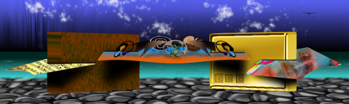
Post by blackpenny on May 19, 2011 18:19:41 GMT
Nice use of primary colours. I like contrast of the yellow in the background.
|
|
|
|
Post by Leif on May 29, 2011 10:20:55 GMT
Just for the fun of it. I wanted to make Marge and Homer look as if they dressed up a bit nice and a bit younger.  |
|
|
|
Post by Helen on May 29, 2011 17:46:13 GMT
Wonderful work, once again. They look very elegant. I also like how you depicted Homer's tummy. |
|
|
|
Post by Leif on May 29, 2011 18:22:56 GMT
He, he. Yes, as i gave Homer hair i wanted to make him look younger. So i didn't want him to look quite as overweight as usual. ;D
|
|
|
|
Post by barbieq25 on May 29, 2011 22:14:22 GMT
Very nice work! I like the younger homer & Marge is as elegant as always.
|
|


 I just want you to know that I'm in love with your work. It's extremely well-done. Wow.


 "]
"]