|
|
Post by Sargon III on Jan 15, 2011 6:00:34 GMT
@heat stroke, thank you mate, I am glad you like it, congratulation the award. blackpenny, thank you, yes it is Jupiter like but not our Jupiter  Helen Helen, thank you very much TheBad1, thank you mate, I do have a lot of patience when it comes to learn a new program, you are a great artist, I feel honored to hear that from you. Congratulation the awards. Goonfella, thank you very much, means a lot to come from king of space, I think I got your point about the texture, I searched more pics of Jupiter but couldn't achieve same effect, this what I got so far it needs some more work because it looks cartoony  I use then S3D to shape it: 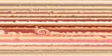 barbieq25 barbieq25, thank you very much and congratulation the award. Leif, thank mate glad you like it @beyond Redemption, I am lost  , well but not now, lol, you are sokagirl? right? thanks for your comment. |
|
|
|
Post by lancemcknight on Jan 15, 2011 14:39:01 GMT
Sargon, take a quick look at Sidney's tutorial at the old Fanatics board ( Link). See if you can't put your own spin on it. |
|
|
|
Post by Sargon III on Jan 17, 2011 19:52:06 GMT
Thanks Lance, here is the result, nice tut Sidney btw: 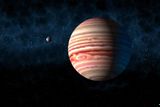 And this is Liquify Smoke attempt: Colored: 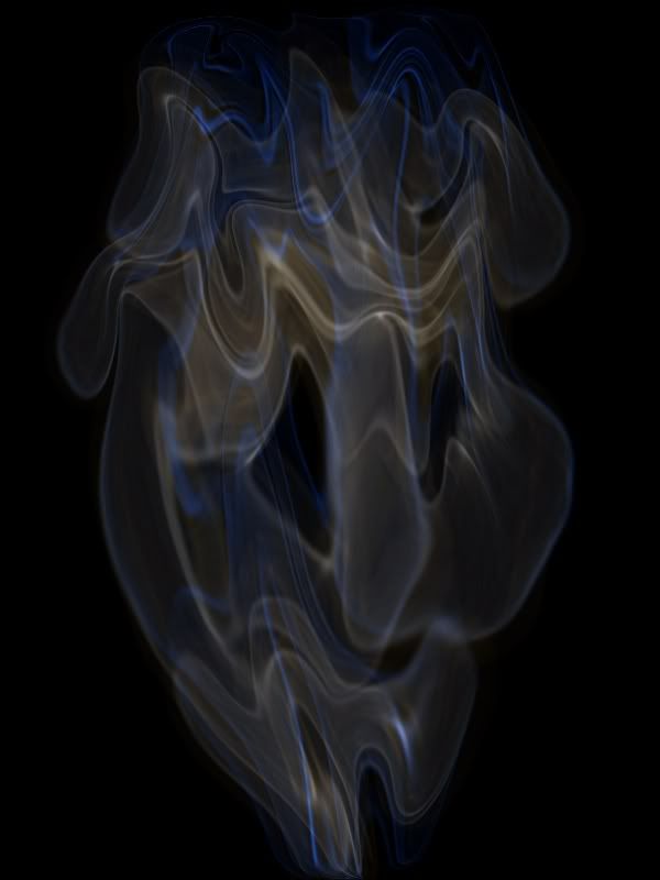 B&W: 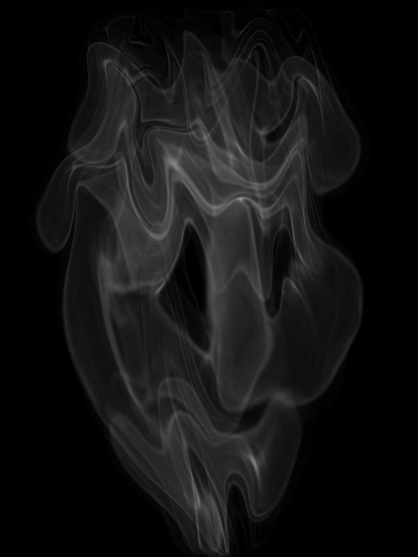 |
|
|
|
Post by Leif on Jan 17, 2011 20:03:37 GMT
Planet is just getting better and better. Color is more like the real Jupiter and great adding the moon.
On the smoke i prefer the colored version.
|
|
|
|
Post by heat stroke on Jan 17, 2011 20:25:58 GMT
The planet, like Leif said, keeps getting better! The smoke is amazing!
|
|
|
|
Post by barbieq25 on Jan 17, 2011 23:21:41 GMT
Good smoke effect. B & W one is most effective.
|
|
|
|
Post by Helen on Jan 17, 2011 23:31:21 GMT
Ooohhh...I love the swirls on the planet. It makes it look so cool. The smoke you did with liquify is wonderful. Maybe you can have it tapering out in the end by using the pinch option. That way, it will look like it's coming up from somewhere.
|
|
|
|
Post by blackpenny on Jan 20, 2011 3:37:55 GMT
Great smoke. I think I see a face in it. I like both, B&W is dramatic, and the little bit of colour is neat.
|
|
|
|
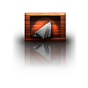
Post by Pixey on Jan 20, 2011 14:50:22 GMT
Golly - Virus Attack is spectacular. The texture and colours are so fluid. It looks, to me, like intestines and they look all slithery and warm. Something like when Ducky cuts into a corpse on NCIS Amazing! The planets and the smoke are looking great and I too can see spooky faces in the smoke  |
|
|
|
Post by AFG on Jan 22, 2011 15:10:36 GMT
Still pushing the bounderies PDN my friend and still producing stunning work ;D
|
|
|
|
Post by Sargon III on Jan 23, 2011 5:26:13 GMT
Thank you very much Leif, heat stroke, Barbie, Helen, blackpenny , Pixey and afg, for your lovely comments and nice words.
@ afg, so glad to see you here, and thanks for taking the time to put a comment.
|
|
|
|
Post by TheBad1 on Jan 25, 2011 21:59:35 GMT
This is why you should have the King of Paint.NET accolade. Truly awesome mate. I've a few pieces unfinished because I wasn't happy with the smoke in some - thanks to you I can open them again  |
|
|
|
Post by Sargon III on Jan 26, 2011 5:12:37 GMT
There is just one king Welshy, and our PDN kingdom already elected him . and everyone is happy and satisfied, thank you mate for the nice words, and I am glad I can help. This is Apple Mouse, Inspired by Goonfella's mouse work, it is all 100% PDN: 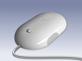 |
|
|
|
Post by barbieq25 on Jan 26, 2011 9:27:52 GMT
Sargon, that is so smooth! I've never seen an Apple mouse but I like your image. The engraved icon really gets me. Fabulous!
|
|
|
|
Post by AFG on Jan 26, 2011 14:34:45 GMT
excellent work mate, the only thing i would pick up on is the button, the shadow makes it look like it is sitting on top of the mouse rather than being inset, wonderful work though |
|
|
|
Post by heat stroke on Jan 26, 2011 16:01:15 GMT
Awesome job! WOW, it looks so real!
|
|
|
|
Post by blackpenny on Jan 26, 2011 16:10:08 GMT
The mouse is nice and smooth, very realistic.
|
|
|
|
Post by Leif on Jan 26, 2011 16:16:55 GMT
Great work. Excellent use of bluer and gradient.
|
|
|
|
Post by Manc on Jan 28, 2011 15:25:07 GMT
I love your work and have learnt so much from your tuts.Thanks. |
|
|
|
Post by Sargon III on Jan 30, 2011 22:28:29 GMT
barbieq25, thanks you very much. AFG, thanks mate, the button, I meant it to be sitting on top, but I am not sure if you mean same thing, or you are referring to the edges of the mouse around the button? I know there is something wrong with this button, may be you had figured it out but I am not understanding your point. @heat stroke, thanks mate. blackpenny, thank you very much Leif, thanks so much, yep that was blur and gradient used to get this effect. @manic Manc, thanks you very much, and I am glad I can help, we all here learning from each other, and you are doing a great work, I wasn't good as you when I started using PDN 4 years ago. ..I have another banner work, do you think it is good enough to submit it? 
|
|
|
|
Post by heat stroke on Jan 31, 2011 0:24:42 GMT
I like it, and encourage you to enter. The 3D effects is cool!
|
|
|
|
Post by barbieq25 on Jan 31, 2011 5:11:47 GMT
I like the banner very much! Very cool!
|
|


 I use then S3D to shape it:
 , well but not now, lol, you are sokagirl? right? thanks for your comment.


 "]
"]


