|
|
Post by TheBad1 on Jun 23, 2011 18:05:26 GMT
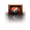
That's a really nice texture.
The green text really compliments it. Nice one
|
|
|
|
Post by blackpenny on Jun 24, 2011 19:17:49 GMT
Great gallery, and it's good to see you here.
I like the rusty sig - nice texture.
|
|
|
|
Post by an evil guy on Jun 24, 2011 20:11:59 GMT
thanks Dug the splashing was part of the font but yeah i thought i chose the perfect fornt for it  Welshblue cheers the texture is my favorite part i enjoyed making it blackpenny thanks for the welcome and the compliment on the sig |
|
|
|
Post by Dug on Jun 25, 2011 9:15:10 GMT
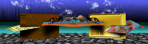
Nice wallpapers both.The second one I just love,I like minimal wallpapers.Good work!
|
|
|
|
Post by AFG on Jun 25, 2011 9:20:31 GMT
Like the effect of the first wallpaper, but the second one has more impact, Im not sure what it is, the highlights on the shapes? the white negative space? what I don't know , I just really like it.
|
|
|
|
Post by Leif on Jun 25, 2011 18:55:46 GMT
First wallpaper is almost hypnotic. ;D Pretty blend of black and white gradient to make it look metallic. And the single color just ads to the metallic look. Great work.
|
|
|
|
Post by barbieq25 on Jun 26, 2011 7:28:41 GMT
My fave too is the second one for the reasons AFG stated. I like the almost intertwining shapes in the first one. Both of them are really good.
|
|
|
|
Post by Pixey on Jun 26, 2011 13:36:16 GMT
I love both of them They are so neat and crisp. Very good result indeed |
|
|
|
Post by Helen on Jun 27, 2011 17:05:59 GMT
To tell you the truth, Polar Inversion is one of the Distors I don't really use (psssttt...because I don't know what to do with it). You have two lovely wallpapers. The bottom one with the drop is really neat.
|
|
|
|
Post by TheBad1 on Jun 27, 2011 17:49:46 GMT
To tell you the truth, Polar Inversion is one of the Distors I don't really use ... Hint ... used heavily in my 2 Minimal ones  I like the way the 1st one is quite hypnotic, the colours work really well. My fave tho' is the 2nd one. I like that a lot |
|
|
|
Post by an evil guy on Jun 29, 2011 15:56:26 GMT
wow thanks everyone for the great comments helen you should have a go make a shiney orb then play with the polar inversion tools its great fun  my fave is the second one too the bit at the top i made by accident and just left it like that the drop took a while to get wright with the polar inversion tools but im still not 100% about the drop not sure if it just looks out of place or the fact it doesnt have a shadow and were would i put a shadow  but thanks again everyone for the lovley comments |
|
|
|
Post by heat stroke on Jul 2, 2011 13:28:54 GMT
I really like both! Like the others have said, the metallic look of the first one is really cool! The second is my favorite though, because I am allways a fan of simple looking wallpapers. "exciting" wallpapers make the icons hard to see (at least for me...). Plus, I think it is really well done, and the drop is great the way it is!
|
|
|
|
Post by barbieq25 on Nov 16, 2011 11:10:02 GMT
Ok, just to let everyone know that it is still here |
|
|
|
Post by Pixey on Nov 16, 2011 14:25:21 GMT
I can see it too |
|


 "]
"]


 my fave is the second one too the bit at the top i made by accident and just left it like that the drop took a while to get wright with the polar inversion tools but im still not 100% about the drop not sure if it just looks out of place or the fact it doesnt have a shadow and were would i put a shadow
  but thanks again everyone for the lovley comments