|
|
Post by heat stroke on Aug 17, 2011 17:31:36 GMT
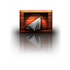
TutorialPlease tell me if I need to change/add anything. I hope this helps and I look forward to seeing your results!
|
|
|
|
Post by Pixey on Aug 19, 2011 15:04:01 GMT
Many thanks for this tutorial heat Stroke  (and the help with the links for Apo). I played about with this tut and got loads of different results. Herewith my best shot:  |
|
|
|
Post by heat stroke on Aug 20, 2011 13:33:54 GMT
You are welcome Pixey! Great result! I love the personalized gradient! And the logo looks awesome too! I think the shadows could be darker, but that may just be me. The shadows were very hard to reproduce for some reason. I actually did that part of my current sig in PDN, so I cant figure out why I cant do it the same way again...
|
|
|
|
Post by blackpenny on Aug 20, 2011 19:47:42 GMT
Okay ... it took a few tries (because I lost my place and had to backtrack :  but I did it! I liked it better on a black background and with the larger logo because I didn't like the way the logo reflected. Not sure which one of these I like better - I think I got something backwards somewhere. *lol* One comment - in the version of AlphaMask I have, there is an option to copy to the clipboard, so you don't have to save the mask as a separate file. You copy the mask layer, and in the AlphaMask window check Paste from Clipboard. It confuses me a lot less than having to save a mask image.  Thanks for the tutorial! |
|
|
|
Post by TheBad1 on Aug 20, 2011 20:29:50 GMT
Nice mate. Thanks for this, I'll give it a go this weekend Nice results ladies |
|
|
|
Post by Sargon III on Aug 21, 2011 5:19:17 GMT
Excellent tutorial HS, I need to try this, and agree with welshblue your sig is awesome, and it looks so beautiful on the red background.
Pixey and blackpenny, very nice results, bp, I like the second one, the reflection look much better to me, how about adding a reflection to the glassy flowers icon as well?
|
|
|
|
Post by heat stroke on Aug 21, 2011 15:57:21 GMT
Great results BP! I think the reflection is a little bright in the first one. And the logo looks great larger than the text. I never thought to do that... I forgot about that version of Alphamask, I will edit the steps to account for that version (sometime soon hopefully). Thank you both Welshblue and Sargon!  Does anyone have the link to the version of Alphamask that allows you to use whatever you have in your clipboard as a mask? Im having a hard time finding it to link to as an alternative plugin. |
|
|
|
Post by blackpenny on Aug 21, 2011 16:19:46 GMT
Illnab1024's AlphaMask plugin forums.getpaint.net/index.php?showtopic=1854I have a hard time finding some of these plugins too. A lot of them are part of a pack and not listed separately. Someone should start a thread of our favourite plugins and where to find them. I didn't actually 'think' to make the logo larger, I forgot to leave room for it.  *lol* Here's a version with transparent background and the small logo reflected. |
|
|
|
Post by blackpenny on Aug 21, 2011 16:20:06 GMT
Oops --- double post!
|
|
Chito
Apprentice

Posts: 53
|
Post by Chito on Aug 21, 2011 22:01:45 GMT
Great outcome HS, however, I'm a bit stuck on step 6 and need a little assistance. I don't quite understand what you mean when you say: How do we do that? Do you mean click the "Move Selected Pixels" tool and move it down or? Also where you say: Where do we adjust the transparency of that specific layer? Add step 7 to my confusion as well lol Thanks in advance. Note: Throughout your tut you say to click 'ctrl+n' to create a new layer, but that opens a new project. Need to change it to 'Ctrl+Shift+N'. |
|
|
|
Post by heat stroke on Aug 22, 2011 0:17:13 GMT
Thanks for the link BP, and that result looks great! I like the reflection under the logo. How do we do that? Do you mean click the "Move Selected Pixels" tool and move it down or?
Yes, use the 'move selected pixels' tool and move the gradient wherever you want it. Also, use the 'nubs' on the top and bottom of the selection to scale it down, that way the gradient doesnt fill the canvas. Where do we adjust the transparency of that specific layer?
By double clicking on the layer, you can change its name, select blend mode, and adjust the transparency/opacity of the layer which ranges from 0-255. I have a bad habit of referring to it as 'transparency' instead of 'opacity'. As for step #7: In step #5, you used the "multicolor gradient" plugin. If you used the same settings as I did, then the colors that are on the top and bottom are black and #1f1f1f. When you size down the gradient to fit over the text however you want it, fill in the top and bottom with those same colors. I did this because when I sized down the gradient, some parts of the text were not covered by the gradient. So I filled the gaps with the colors so there would be no gaps. I hope this helps, sorry for the late reply. If I still did not explain it good enough, just tell me and I will add more screen shots to help. And thank you for the correct shortcut. The worst part is, I use this one all the time, and yet I type it wrong in the tutorial.  |
|
Chito
Apprentice
Posts: 53
|
Post by Chito on Aug 22, 2011 4:47:35 GMT
Ok, so after lots and lots of backtracking I finally came up with this:  There are a few steps (too many to list lol) that I wasn't sure if I followed correctly. I didn't make much changes to it from the original tutorial, since I wanted to try it out first before customizing it more to my taste. I guess it's ok for my first try lol. A couple of things about the tut that may need to be checked out and edited? - On step 34 it says "Duplicate this layer and on the top “Shading” layer..." shouldn't it instead say "Duplicate this layer and on the top “Shadows” layer...", since in step 30 you had created the “Shadows” layer? I may be wrong on this...
- In step 11 you say "Go to effects>stylize>drop shadow..." I believe it should say "Go to effects>object>drop shadow..."
Thanks for the tutorial HS.  |
|
|
|
Post by heat stroke on Aug 22, 2011 12:30:55 GMT
Step #34 should say shadows. Sorry for that confusion. I should've looked a lot closer and paid more attention to the words I used. Thank you so much for pointing that out. As for the drop shadow: Mine is in stylize. I thought I still have the up-to-date version, but I guess I may be wrong. I will look into that. Its probably because there is a new version and it is now in object. Your result:  Slick! Your logo goes very nicely with the text! It looks like you got some jaggy edges on the tops of your text as well. I got those, but figured I had changed the position of the text from the mask. I think I will look into that as well, maybe add some feathering somewhere... Thank you for your help Chito! |
|
Chito
Apprentice
Posts: 53
|
Post by Chito on Aug 22, 2011 19:15:47 GMT
You're very welcome HS and thanks for the feedback. Yea, I couldn't figure out how (or in which step) to smooth out the jaggy edges. I kept trying to choose which layer to perform it on, but I figured it would ruin the rest of the work being done. Maybe the next time I try this tut out I'll experiment some more. |
|
|
|
Post by lancemcknight on Aug 23, 2011 22:53:44 GMT
Sometime, it might help to flatten the layers and run alpha masking to help clear the edges. I have done that before. Just make sure to save the original files with layers intacts than to scream, "No!" when it is discovered you saved without keeping the layers intact.
|
|
|
|
Post by chrisco97 on Jan 9, 2013 7:23:35 GMT
I LOVE the shadow effect here! I may use it sometime. The signature design is of course amazing too. Very original. |
|


 (and the help with the links for Apo).
  "]
"]


 but I did it! I liked it better on a black background and with the larger logo because I didn't like the way the logo reflected.


 *lol* Here's a version with transparent background and the small logo reflected.


 Slick! Your logo goes very nicely with the text! It looks like you got some jaggy edges on the tops of your text as well. I got those, but figured I had changed the position of the text from the mask. I think I will look into that as well, maybe add some feathering somewhere...