|
|
Post by barbieq25 on Nov 6, 2011 7:34:39 GMT
Here is what Helen wrote & I am wondering the same thing but I don't want to hijack PP's gallery. Peter, you have beautiful work yet once again!  Wow! As for the tarnished look using S3D, Sargon mentioned before that you have to check off a setting that keeps the texture. I don't remember, however, what it was.  |
|
|
|
Post by barbieq25 on Nov 8, 2011 21:48:20 GMT
i468.photobucket.com/albums/rr44/PeterPawn/SteampunkWLLPPR2.jpg I like the brushed copper look of the background PP but it could use a bit of tarnishing. The cogs themselves are overbevelled. Try cutting back the bevel & use trail? Chad's concrete tute is invaluable for this kind of work. I've overlaid it with a goldish gradient & I reuse this a lot. Remember that you can increase the size to give you more or less tarnish too. All of this is much easier said than done & I must keep a notepad so that I can remember what worked. Sadly I did not do that with my previous forays into the steampunk stuff. I'm with you all the way PP. Steampunk is awesome & I guess a natural progression (regression??) for us. It is also very difficult to do. Wonder if that machinery actually works in the background? P.S. I think I remember some of how to make the gold concrete. Obviously do the concrete tute then a reflected gradient on the layer above with Primary colour: FFE887 Secondary CIA100 or something like that. Then play with the layer blend modes/brightness & contrast. Here's some of my forays into the steampunk: i582.photobucket.com/albums/ss265/barbieq25/Abstract/TheNautilusWindow-1.pngi582.photobucket.com/albums/ss265/barbieq25/Abstract/DarkFleur.pngi582.photobucket.com/albums/ss265/barbieq25/SAC/SACSteampunk-1.pngI look forward to learning with you all.
|
|
|
|
Post by TheBad1 on Nov 8, 2011 22:06:22 GMT
Agreed with Barbie' about the gears. Why I'm not a huge fan of Metallize. They're much too glassy I can't see the image she's posted but I agree your background looks good - but needs some depth (as in texture) and a bit more pale pinkish colour to make it copper. Also agreed about Chad's concrete tut. I use it in all my textures. A tip ... it can look effective if you invert the colours of the finished concrete - A bit of Jitter sometimes gives nice results for scratches then using a transparent gradient to get clear parts on your image. Another good way to get texture is to use Bloopers method in the 101 thread : Click ... a bit of Crystallize/ and then Relief can again give interesting results. When you've made a texture and colour yo'ure happy with ... save it. It saves a lot of grief having to make new ones ;D I think one thing to remember when making steampunk is that it's all geared (pun intended  ) around the industrial revolution and victorian times. There wasn't a lot of polished metal around back then. Rough casts and matte finishes |
|
|
|
Post by lancemcknight on Nov 8, 2011 23:14:18 GMT
And steam pipes too!
|
|
|
|
Post by PeterPawn on Nov 8, 2011 23:34:31 GMT
WOW!!! All this is very helpful. Thanks Barbie for starting this thread. I've got a lot to learn.
Instead of thanking each of you individually I just want to say thanks to all of you. There's a lot of good input here. I think that a combination of all of these techniques, properly balanced, will give the results I'm after. I think I find myself on a quest here to figure out a good "steampunk" method. I didn't learn the "gold" and "jewel" technique overnight and this is going to take a while.
The irony of all this is, I've spent years learning how to make gold look pretty and shiny and now I want to make metal look tarnished and rusty. Go figure....
Thanks again to everybody, you're all wonderful.....
|
|
|
|
Post by barbieq25 on Nov 9, 2011 7:34:18 GMT
I'm glad you brought the subject up PP as I have enjoyed the forays into it but as yet have to perfect it. Like you, I've spent ages on the shiny polished look & now I want to go the opposite way too. I've been trying to get some decent looking templates for gears & cogs for the last few years. Welshy's fault for his tute & the image that he did. Quite steampunky if the colours were changed & unshinied! Great input from all of you. PP, I can send you the .png of the texture - aw what the heck - I'll upload it now., Hang on... It is huge - nearly 5MB because I work in a huge canvas. 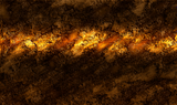 |
|
|
|
Post by PeterPawn on Nov 9, 2011 23:07:03 GMT
Barbie: I have some templates for you. I sent a link to you via media fire in a pm.
Thanks for sharing the texture. It looks great.
|
|
|
|
Post by PeterPawn on Nov 10, 2011 5:14:14 GMT
Here was my first attempt to create something "steampunky."  I think I've finally accomplished the color of copper. Here's a copper ring that I made.  I made some corrections based on input from Barbie and Welsh and came up with this new rendition.  Still not sure about the background because I wanted it to look more like copper/metal. Not sure how to make it look tarnished. Still a work in progress. Your input please. |
|
|
|
Post by Goonfella on Nov 10, 2011 7:10:33 GMT
Well I think you have got the colour of the copper right. I looks really nice, and I like the texture in the background . I think the vignette is a good idea as well as it focuses your attention onto the gears. The one problem I can see with this is with the gears themselves. The teeth on most of them seem to be too smoothed out so they no longer link together properly or look totally worn out . You can see this best in the largest gear where there are supposed to be teeth on both sides. It just doesn`t look right to me. Sorry. Fix the teeth on the gears and it would make such a difference. I like what you are trying to do here , and wouldn`t it be great if they were animated? Nice one PP  |
|
|
|
Post by barbieq25 on Nov 10, 2011 10:48:45 GMT
The copper ring is fabulous. I love the twist & the colour is spot on.
Getting the cogs to mesh is not easy at all. Just spent an hour on the ones I did for Madjik's tute.
Getting the copper colour aint easy either. I did copper leaves once but that was a fluke.
Getting the rusted look was the easy part. I over laid the pattern & cut the cog out.
PP, not easy but an enjoyable frustration.
|
|
|
|
Post by PeterPawn on Nov 11, 2011 4:40:47 GMT
Barbie: "Enjoyable Frustration," interesting term but accurate. I think I've got the color right for brass now. Here's a brass ring. With copper and brass in my color arsenal I think I can concentrate on steampunk ideas now.  Also... I think I've figured out a way to add green tarnish to the copper background. Here's how it looks.  Goonfella Goonfella: I see what you mean regarding the smoothness of the gears. The smoothness resulted from using "feather" plug-in to get rid of "jaggies." Not sure what to do about that. Any suggestions anybody? |
|
|
|
Post by barbieq25 on Nov 11, 2011 10:51:59 GMT
Brass is looking good & I like the green tarnish too.
|
|
|
|
Post by lancemcknight on Nov 11, 2011 14:09:15 GMT
Peter, try to Gaussian blur at either 2 or 4 pixels to smooth out the edge. I also love the AA plug-in. It does a killer job of killing the aliased edge.
Keep it up!
|
|
|
|
Post by Goonfella on Nov 11, 2011 18:22:06 GMT
I agree with Lance. AA = Absolutely Awesome! |
|
|
|
Post by TheBad1 on Nov 11, 2011 22:07:13 GMT
AA does = Absolutely Awesome. Also works great if you use Feather (or Old Feather now BoltBait has brought it back  before running AA I never work x3 and am always mostly happy with my edges The brass ring is looking good ... a bit of lightness needed though ? For a reflective look The background looks great ... again a bit of brightness needed ?  ... I don't think the tilted ones go with the image. Great colours but they whack the eye out. A bit abstractish for the look you're wanting to achieve IMhumbleO Great progress tho'  |
|
|
|
Post by PeterPawn on Nov 12, 2011 4:13:07 GMT
Thanks for all the input guys. I went back to the drawing board, considered all of your comments and came up with this. This is version 5. I think I like this one. The gears are clearer.  Give me your thoughts. |
|
|
|
Post by lancemcknight on Nov 12, 2011 13:26:30 GMT
It is a vast improvement over the previous version. I see you made change to the gear on the bottom. The bottom right gears are going to be touching something? In my mind's eye, I see something that would resemble a locomotive engine with steam pipe on the bottom coming out of this work. I'm intrigued by the development of this piece.
|
|
|
|
Post by venicet on Nov 12, 2011 15:46:10 GMT
wow Peter, you are coming along fast in your learning steampunk Great job! |
|
|
|
Post by PeterPawn on Nov 13, 2011 3:29:08 GMT
@lance: Actually no, not thinking of the bottom gear touching anything. I'm thinking of this as a finished image because it's a wallpaper and an abstract. Wallpapers cannot be too "busy" in my opinion because it intereferes with folders and other "things" that someone might have on a desktop. Also, this piece was experimental in that I was using it as a test piece for future steampunk ideas and developing techniques to make colors and textures. I am working on other images however that have more detail with pipes and levers. I'm collaborating with someone on this. venicet: Thanks for the compliment, I appreciate your interest and support. Great to hear from you. |
|
|
|
Post by barbieq25 on Nov 13, 2011 20:58:14 GMT
The very bottom gear is the texture that I like the best. The rest of them are too glossy/glassy but you've certainly come a long way in this style. Much better background & I like the layout of the cogs too. Keen to see what else you have in mind |
|
|
|
Post by Sargon III on Nov 14, 2011 3:27:26 GMT
Helen and barbie, about the very first post, yes I remember I said that to oma to turn off or decrease the Specular Highlight in S3D so the plugin won't smooth up the texture, it really doesn't change the texture itself but a way of cheating the eye by playing with highlight/shade so the brain parse it as it is a flat surface. @peter, good progress, try to work on larger shapes, the gears of your image came from a small stencil, so you don't have enough room to adjust the bevel on the edges, that's why the look so smooth, I rarely use Bevel Selection for edges because it affects the highlight in most cases, I use instead Engrave/Emboss or Diffuse/Specular plugins then Alpha Mask, I recommend-if you are working on large objects-Diffuse plugin after blurring then Alpha mask. And Lance is right, pipes give a very good effect especially the ribbed/spiral ones. And also try to make the image with more than one layer, not meaning layers of PDN but the effect, like here in your last image is just 2 layers the cogs and the background, put the cogs on top of each other to give it some more depth, but it is in this image, as you said you like it a simple wallpaper. BTW, why not trying to make the gears templates yourself? Kaleidoscope or SinWave/Wobble with Polar Transformation give an excellent result.
|
|
|
|
Post by PeterPawn on Nov 14, 2011 4:27:19 GMT
Thank you so much Sargon for all this information. I will definitely explore your suggestions to improve this technique. Sooo much to learn, so little time......... |
|


 ) around the industrial revolution and victorian times.


 "]
"]

 before running AA