|
|
Post by barbieq25 on Jun 10, 2012 3:07:24 GMT
We are very fortunate to have Ebony & Purple as skins as well as the default skin but we have the same old buttons. If you like to personalise this is going to be just your cup of tea or whatever you like  Your brief is create a universal set of buttons that goes with all of the skins. Easy eh? Nope, it isn't as anyone who has worked in a small canvas can tell you. This is one time where working large & reducing is not going to work well. Here is what you are creating. 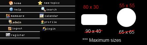 We initally thought that the maximum size would be as indicated but a tad smaller would be better, so please stick to the red sizes. When posting the buttons, please submit a single image that shows 3 rows of buttons (one row for each skin - one in ebony (dark charcoal) purple & white.) The example is all jammed in together but what we want to see is how each one would look as a bar across the top of the page under the banners. Deadline: 30 June 2012 Limited to 3 entries per person. Please post all questions & comments here. Entry thread is here[/b] |
|
|
|
Post by Pixey on Jun 10, 2012 11:04:23 GMT
Great - I'll have to digest all of that  It sounds difficult  P.S. The entry thread link is dead on this page |
|
|
|
Post by barbieq25 on Jun 10, 2012 22:15:42 GMT
It isn't complicated but it sounds it, doesn't it?
Basically you are making I set of buttons that goes with either dark charcoal, white or deep purple. Then you showcase the buttons on the different colours as one image.
If you take a peek at the Ebony skin you will see that it has oval buttons with words. The purple still has the default words & icons. So you can be creative as you like or smooth & slick.
My mind is going back to some of the marvellous steam punk images where the buttons glowed.
Remember too that they don't have to be round or capsule shaped (I know there is a word for it but too early for me).
Thanks to Pixey for alerting me to the dead link - now fixed.
|
|
|
|
Post by Pixey on Jun 11, 2012 6:50:20 GMT
Thanks @bbq for that, which answer the questions that I had lurking in the back of my mind. The 'capsule' was driving me nuts yesterday as, whatever I tried, there is always a bit of square left at each corner  I'm such a dumb-dumb sometimes  And, as for the colour ebony - guess I need to look at the skin for that. Ooooo boy - back to the drawing board  |
|
|
|
Post by barbieq25 on Jun 11, 2012 9:27:35 GMT
Pixey are you saving it as a .png?
|
|
|
|
Post by Pixey on Jun 11, 2012 9:55:26 GMT
Pixey are you saving it as a .png? Yes, am saving as png. I think the 'corners' disappear when I upload it now ..... testing:  OK - I see the corners do go away when it is 'posted'. But I can see corners when it's in the software. Hope that makes sense? Anyway, think I've got it sorted now. The above image is just a test |
|
|
|
Post by barbieq25 on Jun 11, 2012 21:08:43 GMT
There you go - we all learn something new. Button looks great with the gradient.
|
|
|
|
Post by Pixey on Jun 13, 2012 12:36:21 GMT
Sorry, me again ....... how does one find the skins to look at? |
|
|
|
Post by Ella on Jun 14, 2012 8:46:00 GMT
I tried something here and need help what do you think which looks better the regular version or sharpened version? ADDED: I also noticed the Photobucket picture is actually fuzzier than the regular image on my PC so I am not sure how it will look like on forums, anybody have experience with that? regular:  sharpened:  I will also post the preview background if anybody wants to use it for their own button preview or tryouts .  |
|
|
|
Post by Pixey on Jun 14, 2012 9:01:56 GMT
Ella - love your buttons and I think the 'sharpened' look a tad, well ........ sharper I can now use your skin colours as a guide, thanks, as I never figured out how to see the skins in the profile area
|
|
|
|
Post by barbieq25 on Jun 14, 2012 20:58:21 GMT
Thanks Ella for the "Preview Template".
I like the sharpened view too. Very classy & stylish buttons that look great on any of the backgrounds.
|
|
|
|
Post by blackpenny on Jun 15, 2012 23:09:46 GMT
Great entries so far.
I'm sitting this one out to focus on calligraphy for a bit. But I've saved Ella's background preview (thanks Ella!) in case I get around to it.
|
|
|
|
Post by barbieq25 on Jun 16, 2012 9:10:47 GMT
Sorry Pixey. In my haste to read & respond before flying off to work, I didn't see the question on the viewing the skins.
If you go to the profile page, you can then select "Modify Profile" from the band across the top.
Then scroll down a fair way & you will see the drop-down box from which you can select a skin & then click "Modify Profile" on the far left. Be careful as the "delete account" is very close by too & is usually where you expect the ok button to be.
Hope this helps.
|
|
|
|
Post by Pixey on Jun 17, 2012 13:44:01 GMT
Many thanks BBQ - I'll remember that for future use |
|
|
|
Post by TheBad1 on Jun 22, 2012 21:23:59 GMT
Really nice entries posted so far One thought that came to me earlier today (which I find really sad as I was driving at the time ) ... is that one thing that should have been set out in the rules is that: all the buttons should have a totally transparent sibling, allowing them to be placed in the slots provided by proboards via photobucket or other My bad. I should have thought about that before now. BTW Ella - very useful template |
|
|
|
Post by Sargon III on Jun 24, 2012 0:11:49 GMT
Right Welshy, I thought about that too, and was wondering how we gonna send the files to you, I have everyone of mine on its own PNG file with 30x80 size, I think the best way is to send them after the voting, so you won't get confused by so many files, at that time you will get just the wining files, one set or may be 2 or 3? Depend on the poll and how proboadrs handles them.
|
|
|
|
Post by barbieq25 on Jun 25, 2012 23:36:34 GMT
Totally transparent? As in the background, just the button transparent?
Yeah, I had an uneasy feeling that I missed something. Oh well we live & learn.
I am still trying to get my idea to work. Maybe it is time to abandon the idea...as Henry Ford said - Failure is simply the opportunity to begin again, this time more intelligently.
|
|
|
|
Post by TheBad1 on Jun 26, 2012 21:13:09 GMT
I have everyone of mine on its own PNG file with 30x80 size, Oh you star. Then it's just a case of uploading them to photobucket, then putting the direct lonk into the menu slots. You won't be sending them to me  I think this is a good chance for my 2 companions in the Ivory Towers to learn some of the ropes ;D ( With guidance all the way ) *** I must add at this point: no matter what format any entries have been saved in, it can all be salvaged with a bit of editing, so not a big problem. As for how the winning entries are sent to us, email should be okay as they'll only be small files. Or there's mediafire or any other equivalents. @ BarbieQ' ... you didn't miss anything. Knowing the control panel as I do, I really should have factored it in. I've got to admit I'm struggling to make a set - both in inspiration and before the deadline. Not an easy task this. |
|
|
|
Post by barbieq25 on Jun 26, 2012 23:40:02 GMT
I am all in favour of extending the dealine if we are in agreeance?
2 weeks or only 1?
|
|
|
|
Post by blackpenny on Jun 27, 2012 17:13:01 GMT
I am still trying to get my idea to work. Maybe it is time to abandon the idea...as Henry Ford said - Failure is simply the opportunity to begin again, this time more intelligently. I've abandoned my calligraphy project, I didn't allow myself enough time to re-learn how to do it, or test paper/ink/pen and get them all working together. Having the sewer incident two days before the registration deadline didn't help either. I'm still going to do it though, for me anyway. So if the deadline for the button is extended, I guess I have time now. If I had an idea, it would be great. Doesn't matter to me how long you extend it for, it'll take me until the last possible minute as usual. I think this is a good chance for my 2 companions in the Ivory Towers to learn some of the ropes ;D ( With guidance all the way ) Cool!  |
|
|
|
Post by TheBad1 on Jun 29, 2012 21:01:23 GMT
2 weeks would be better for me but I'm happy to go with what the people who've posted entries think.
|
|
|
|
Post by Sargon III on Jul 1, 2012 5:05:48 GMT
It's fine to me Welshy, what I really concern about is to have more entries, we really need to have some more styles,
I think they are not so hard to make, The best way in my opinion is to work on a canvas with ten times bigger than the aiming size (as for 30x80 will be 300x800...etc.) then downsize to the required size then after resizing add the text with its effects and some final touch-ups if it needs.
|
|


 It sounds difficult
 "]
"]
 I'm such a dumb-dumb sometimes
  And, as for the colour ebony - guess I need to look at the skin for that. Ooooo boy - back to the drawing board