|
|
Post by chrisco97 on Feb 1, 2011 17:15:22 GMT
Phoenix is my favourite. I love the gold work in all of them!
|
|
|
|
Post by Pixey on Feb 1, 2011 17:36:58 GMT
They are all special (love the blue in the gem) and the bird is very good, but I especially like Connections - it looks like Hieroglyphs  |
|
|
|
Post by Helen on Feb 1, 2011 23:23:52 GMT
I decided to reply in more detail on DA and the main forum, but I'd like to add that the three latest works are WONDERFUL!!!  |
|
|
|
Post by Sargon III on Feb 2, 2011 6:49:36 GMT
I love Connections for some reason, the colors and goldwork are awesome, I am seeing a castle or palace outline in that lower dark part.
Again the gold work and shape in Phoenix are amazing.
Christian is fantastic, I like the blue tone, and the jewel is just fabulous.
Didn't comment on Hex WP and Spring Flower they are both great, Beautiful work Barbie as usual.
|
|
|
|
Post by TheBad1 on Feb 3, 2011 11:06:44 GMT
Phoenix Rising ... great use of the Droste Plug-in in creating the phoenix and love the gold brocade. A very nice piece, made all the more special by the outlining of the thoughts behind it.
Christian ... a great piece for a worthy cause. I like how the star of the show is the jewel and it's surround, sort of an understated image with a whole heap of meaning
Connections ... this is my fave of the 3. Not sure why. Maybe it's the primary colours used, or the 3Dness of the wirework ... or possibly both ;D
Great pieces all round
|
|
|
|
Post by AFG on Feb 3, 2011 19:28:30 GMT
All different and all with their own story.... Connections is great, the dark shadow layer makes the top layer solid and gives it depth, which in turn creates the 3D effect, very nicely done |
|
|
|
Post by barbieq25 on Feb 4, 2011 0:28:05 GMT
Heatstroke, thank you  Pixey, it does look a bit like hieroglyphics. The gem started out a different colour but I wasn't happy with it till I saw the blue. Helen, your comments make me smile. I love them Sargon, I like very much how everyone sees something different in it. My mum likes this one too. She does wonderful landscapes in oil. Really never expected her to like an abstract. Welshy, sometimes we need an artist's statement. I have always appreciated the way you do that & usually a link to a song that has inspired you. It makes me feel like I am part of the image (not sure that I have explained this bit too well). AFG, every picture tells a story ;D Truthfully, Connections was the one I was least sure about. It is the second attempt at this one. I still have the first which I may go back to. It was a slightly different style of working. So many layers...well see Thanks everyone for your wonderful, encouraging comments. |
|
|
|
Post by Goonfella on Feb 4, 2011 6:52:33 GMT
Bit late to the party , sorry Barnie.(oops!) Barbie! ;D Love your latest works. Very impressive as usual. I think Phoenix Rising is my fave. I think the Droste work to make the bird is awesome. The gold down the side reminds me of Egyptian hieroglyphs. Well done.  |
|
|
|
Post by Leif on Feb 4, 2011 20:50:35 GMT
Your latest work is as always beautiful and surprising. You always have some new inventive way to use those 3D like gold patterns.
|
|
|
|
Post by blackpenny on Feb 5, 2011 17:03:13 GMT
Christian is a beautiful blue, and I like the wire pattern at the bottom.
Phoenix Rising has great colour and gold.
I still haven't decided what I see in Connections, it just looks cool! Hieroglyphics, yes, or maybe some kind of electrical thing. Again, it's neat how everyone sees something different.
|
|
|
|
Post by Ella on Feb 6, 2011 12:58:47 GMT
So much awesome work again and all wonderful . I also find the Connections very interesting - the pattern, colors - all works so well together. |
|
|
|
Post by barbieq25 on Feb 16, 2011 12:06:39 GMT
Thank you everyone for your wonderful encouraging comments! I will post another version of the Connections one soon. It is the original one that I started on but changed my mind partway through.
New one page 1.
|
|
|
|
Post by Ella on Feb 16, 2011 14:25:21 GMT
I love the rich blue color, it always goes so well with the gold, awesome work again . |
|
|
|
Post by chrisco97 on Feb 16, 2011 16:07:54 GMT
Wow, I love the design of it! Great work!
|
|
|
|
Post by Helen on Feb 16, 2011 16:40:53 GMT
Mind-blowing image! Wow! |
|
|
|
Post by Leif on Feb 16, 2011 16:47:38 GMT
Great gold pattern. Instant fave. |
|
|
|
Post by barbieq25 on Feb 17, 2011 12:29:00 GMT
Thank you Ella, Leif, Chrisco & Helen. New images p.1. I've posted up the original connections as promised. I really don't know which one I like better. Also, I think this is the first WIP I've ever posted. Inspired by thisNot sure how to proceed from here. I could add some rust streaks & the big washer but on the other hand sometimes less is better. It had a satin finish before I added the famous concrete texture. Like so: 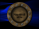 All thoughts/feedback much appreciated ;D |
|
|
|
Post by Manc on Feb 17, 2011 13:27:15 GMT
I really like your new images Barbie,especially the use of blue,my favourite colour. What is this "WIP" that keeps getting mentioned?. |
|
|
|
Post by chrisco97 on Feb 17, 2011 17:37:43 GMT
Wow! The WIP is amazing! I love the texture of it!
|
|
|
|
Post by Goonfella on Feb 17, 2011 19:19:17 GMT
Very nice. Textures are great. I noticed that the wip posted in your last entry and the one on p1 are slightly different. The p1 one is darker. I must say that I prefer the other one as you can see more detail. Nice work Barbie |
|
|
|
Post by barbieq25 on Feb 17, 2011 21:28:58 GMT
Goonie, page 1 is the concrete texture overlay to give it a rusty/old look but the one in the thread just above is the satin look. Not sure which one I should go with. Guess I should have posted them side by side.
Not sure which one you mean? The one in the post above?
Manc, WIP is Work in Progress.
|
|
|
|
Post by Ella on Feb 17, 2011 23:14:57 GMT
I find aged look is more interesting than the smooth one, so my favourite is page 1 . |
|


 "]
"]


 "]
"]