|
|
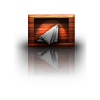
Post by Manc on Jan 15, 2011 11:46:22 GMT
|
|
|
|
Post by Leif on Jan 15, 2011 14:24:17 GMT
That definitely has the WOW effect. Looking really good.
|
|
|
|
Post by heat stroke on Jan 15, 2011 14:26:29 GMT
I love the rings! Very well done!
|
|
|
|
Post by lancemcknight on Jan 15, 2011 14:29:40 GMT
Manc, that is really cool. Love the emblem design on the rings. My only suggestion, in the future, when dealing with Metallize, is to run Gaussian blur (2-4 radius) immediately after to smooth it out. That's a tip from Sarkut's gold metal tutorial.
|
|
|
|
Post by chrisco97 on Jan 15, 2011 15:23:03 GMT
Wow! That is so cool...
|
|
|
|
Post by Ella on Jan 15, 2011 16:27:11 GMT
Really great work and interesting touch with the symbols on rings too.
|
|
|
|
Post by barbieq25 on Jan 15, 2011 16:31:32 GMT
Manc, that is really cool. Love the emblem design on the rings. My only suggestion, in the future, when dealing with Metallize, is to run Gaussian blur (2-4 radius) immediately after to smooth it out. That's a tip from Sarkut's gold metal tutorial. Lance took the words out of my mouth. What he didn't say is the colour of the metal - I like that very much! Well done! |
|
|
|
Post by Manc on Jan 15, 2011 17:18:16 GMT
Thank you all for your kind comments.First time I've posted on gallery so much appreciated. Lance I never used metallize,used curves and colour balance but thanks for the advice.Will bear it in mind for the future,have been running AA assistant a couple of times when I finish.Cheers.  |
|
|
|
Post by lancemcknight on Jan 15, 2011 17:24:16 GMT
Curves and Metallize are roughly the same thing. Metallize automates using Curves.
|
|
|
|
Post by Manc on Jan 15, 2011 18:48:19 GMT
Thanks Lance,didn't realise they were the same. |
|
|
|
Post by Helen on Jan 15, 2011 18:48:50 GMT
Woah! What an amazing piece of work!!! Wow!
|
|
|
|
Post by blackpenny on Jan 15, 2011 20:51:34 GMT
Wow! Great colour.
I didn't know Curves and Metallize are the same either.
|
|
|
|
Post by Manc on Jan 18, 2011 15:07:26 GMT
Finally managed to upload new images.  |
|
|
|
Post by barbieq25 on Jan 18, 2011 22:09:52 GMT
Manc, great sig! Love the new pieces but probably the second one is my fave because of the darkness in it. Wonderful piece! I look forward to seeing more!
|
|
|
|
Post by Manc on Jan 18, 2011 22:17:15 GMT
Thanks Barbie,hopefully I'll start doing more soon. |
|
|
|
Post by Helen on Jan 18, 2011 22:57:58 GMT
First off, nice sig. About your shields. I love them. I think it's the color that gives the shields a war-like feel to them. Awesome! |
|
|
|
Post by chrisco97 on Jan 18, 2011 23:03:41 GMT
Awesome sig, and wonderful shields!
|
|
|
|
Post by beyondredemption on Jan 18, 2011 23:26:10 GMT
Absolutely fabulous , love the color .
|
|
|
|
Post by Goonfella on Jan 19, 2011 0:45:28 GMT
Shields are superb Manc. I think the second one with the different colours is the best and the logo in the centre looks amazing. Nice choice.  |
|
|
|
Post by lancemcknight on Jan 19, 2011 0:53:04 GMT
Manc, I'm glad you finally worked out the linking of the images. I deleted the extra gibberish in your post a few post up. Nice work you did. Keep it up, Manc.
|
|
|
|
Post by Sargon III on Jan 19, 2011 8:15:49 GMT
|
|
|
|
Post by Manc on Jan 19, 2011 14:33:07 GMT
Helen,Chrisco,Beyond,gooney and Lance thanks,glad you like them. Emblem is the badge of my favourite football team, I mess about with it a lot and try to incorporate it in my pics somehow. Sargon,glad you like what I'm doing. I've sorted out direct link to pics,didn't read that part of tut.  Lance and Sarkut,thanks for you help sorting out uploading images. |
|


 "]
"]
