|
|
Post by Goonfella on Jan 29, 2011 21:38:17 GMT
I like the text in the Blue Moon. Very smooth and shiny and perfect for the image. The New Penny is good too. Well done.  |
|
|
|
Post by TheBad1 on Jan 29, 2011 23:20:26 GMT
Great work on blue moon mate. Love those pennies. Personally I ffink the subject matter isn't worth the money they're made of, but the job you've done is priceless  Great copper colour ... c'mon County ... |
|
|
|
Post by chrisco97 on Jan 30, 2011 0:29:36 GMT
That's nice! Cool textures.
|
|
|
|
Post by barbieq25 on Jan 30, 2011 11:06:45 GMT
I like the pennies! Doesn't matter that the colours are not 100% match. I think it enhances the look. Would you post the link to the tute please?
|
|
|
|
Post by Manc on Jan 30, 2011 13:10:24 GMT
Thanks Leif,I hope you meant copper.  Heatstroke,Helen,Goony and Chrisco, glad you like them.I'm gonna update blue moon today, not happy about using stock for water so made some.  Welshy,nice comment thanks.You know what you can do with county.  Are you still drumming? Very funny. Thank you for comments Barbie,sorry no link, not a tut. Thank you all for looking and taking the time to reply. I've updated blue moon. |
|
|
|
Post by blackpenny on Jan 30, 2011 19:51:55 GMT
Blue Moon is looking really good now. The pennies too. The colour doesn't matter that much, they use other metals besides copper. While they're still making them, anyway.  |
|
|
|
Post by barbieq25 on Jan 30, 2011 21:27:13 GMT
Updated Blue Moon looks marvelous! I like the made version of the water even better than the stock.
Sorry, Manc, I just remember there was a tute on that but I forget who wrote it or where I saw it.
|
|
|
|
Post by Manc on Jan 31, 2011 0:08:14 GMT
Thanks for the comments BP. Barbie,glad you like the new water. I've not seen a tute on coins,but I know somebody on main board has got a coin for their avatar. Not seen it for a while,but that's where I got the idea. I was trying to make copper the other week but got side-tracked and made shields instead.lol. I do things like that all the time,messing about trying to make a certain texture and something else happens. I've just been searching on the main board and notice J.D has got a bronze medal as an avatar,maybe that's where I got the idea.  |
|
|
|
Post by Manc on Jan 31, 2011 20:30:05 GMT
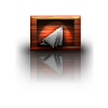
New on page one.Window. I actually started out doing an abstract with Heatstrokes tute,but mind wandered. |
|
|
|
Post by chrisco97 on Jan 31, 2011 21:46:19 GMT
Nice windows! Looks really cool!
|
|
|
|
Post by Helen on Jan 31, 2011 21:49:16 GMT
Very nice curtains. At the thumbnail, I thought it was a photo. I also like its folds. The checkered floor is a great touch!
|
|
|
|
Post by beyondredemption on Jan 31, 2011 23:46:29 GMT
Cool windows ..
|
|
|
|
Post by Pixey on Feb 1, 2011 8:07:19 GMT
Really cool windows and, sorry I missed them, the pennies are super as well |
|
|
|
Post by barbieq25 on Feb 1, 2011 8:37:07 GMT
Great work with the windows! Is the outside on the inside? I like it very much.
|
|
|
|
Post by Manc on Feb 1, 2011 10:56:08 GMT
Chrisco,Helen,BR and Pixey cheers glad you like it. Thanks Barbie,I'm trying to get it as if the outside is reflecting off the glass, not got it right yet.  I'm still messing with it so if anybody can point me in the direction of any tutorials that deal with this sort of thing,or got any tips,would be much appreciated. I think it makes it harder when there is no point of reference on the outside for the eye to see. |
|
|
|
Post by barbieq25 on Feb 1, 2011 11:14:27 GMT
Manc, of course! I am so thick! It does look the other way round to me but I really like it like that. Very quirky.
Maybe the eye needs that point of reference. Perhaps adding a part of a brick wall or some shrubbery?
Honestly, I love it just the way it is.
|
|
|
|
Post by Manc on Feb 1, 2011 12:50:39 GMT
Thanks Barbie.I'd still like some tips on the glass if anybody has any. Just done another version,so put them both up,not sure which is best. I've got rid of the inside,think it was a bit confusing. |
|
|
|
Post by Leif on Feb 1, 2011 15:44:22 GMT
Just looking at the pictures i wonder whether i am outside looking IN; or inside looking out? ;D
The chess pattern makes it quite mesmerizing. What is going on here? And the shapes that makes you think that you are seeing booth he sun and the moon. Very surrealistic. Makes your mind wonder (away from the problems of the real world); and that is sometimes good.
Great work. If were to make any suggestions, it would be to make a kind of shadow / reflection that would very faintly show the pressens of a person actually standing in front of the window.
|
|
|
|
Post by blackpenny on Feb 1, 2011 15:46:51 GMT
I like the window with the checkered floor. It is a bit confusing, but barbieq's suggestion of adding a wall or shrubbery is good. I like that you can see the inside with the outside reflected. I don't know if you've seen it or not, but Sidneys1 has a tutorial on Fanatics on making a glass pane. |
|
|
|
Post by Manc on Feb 1, 2011 15:53:31 GMT
Thanks for your comments Leif and BP,but I've just updated again.Have got rid of the inside cos it was a bit confusing. Yes Leif,I was thinking about putting a person in it,cheers. I think the glass looks ok but will look at tute anyway,thanks again. I've got another idea so am gonna leave this for now, think I'm over working it. |
|
|
|
Post by heat stroke on Feb 1, 2011 17:00:01 GMT
Very nice window you got there! I like the abstract-ness of it all. I dont know if im outside or inside... Makes the viewer think and thats good!
|
|
|
|
Post by blackpenny on Feb 1, 2011 17:03:05 GMT
New version looks good, but I still like the inside/outside look. And I totally understand having to leave something for a while and go back to it later.
|
|


 "]
"]


 "]
"]