
Post by heat stroke on Jan 15, 2011 17:25:16 GMT
This tutorial is a starting point for the abstracts that I make. This tutorial will only take you half way to a finished artwork. When you have finished the tutorial, do not stop, for that is when you can do whatever you want. I tend to think of my abstracts as plugin tests because I usually try out freshly downloaded plugins in them. Its a nice way for me to get to know the plugins I have and so I know what they can do.
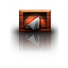
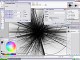
This is a possible outcome, if you stop at the end of this tutorial:
Plugins Needed
Zoom blur deluxe
Splinter Here
Radial blur
Curves
The list of plugins you can use can be found in the plugin index on the PDN main forum
The Tutorial
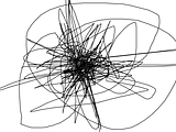
1.) Scribble anywhere on the canvas. A tip would be to try to keep the scribbles more or less centered, but dont be afraid to go wild! Experiment with different amounts of scribbles, different shapes (straight liines, cirlces...), and different center points.
*anther interesting way of doing this part of the tutorial is too scribble mainly around the edges, then go to effects>distort>inside out. Then fill the transparent area with white. You have to play around with that method before it looks right.*
2.) Duplicate the scribble layer and on the duplicate:
use zoom blur deluxe with quality low. Experiment with different amounts.
Set this layer to multiply, or darken. Personal taste will dictate your choice, I like multiply. Merge the layer down.
3.) Duplicate the layer, and on the duplicate:
use zoom blur deluxe again, but with quality high. Again, experiment with different amounts.
Set this layer to darken (I found this usually give the best results, but feel free to experiment). Merge the layer down.
4.) Duplicate the layer and on the duplicate:
use splinter and set it to lighten. Experiment with different settings. This is a major step in the process and will define what your abstract will look like.
Set this layer to lighten (additive can also work) and merge down.
5.) Duplicate the layer and on the duplicate:
use radial blur. Again, try different settings to achieve the look you want. set the center of the radial blur the same as your zoom blur deluxe center (or slightly off a bit to give it almost a broken glass look).
Set this layer to difference. It will most likely look like a black canvas unless you look very closely to the screen, and this is what you want! Merge the layer down.
6.) Go to adjustments>curves. Use any settings you like. It all depends on how bright you want your picture to be.
And this is where you can let your creativity roam free. If there is a plugin you are just dieing to test out, use it! From here on I usually:
1.) duplicate bottom layer
2.) use an effect, two effects, or as many as you like
3.) set layer blend mode to whatever looks good to you
4.) duplicate bottom layer, move it to the top, and start all over!
This is also where you can start adding colors. Black and white sometimes looks good, but colors can make it POP.
*Variations*
You dont have to follow this tutorial exactly how I explain it. you can even switch up the plugins used. In this test, I used motion blur instead of zoom blur. In this test (and countless others) I changed the center position for the zoom blur and the radial blur. In this test, I used dents at the end of ever step in this tutorial. The possibilities are endless, so dont stop at the end of this tutorial, keep adding and adding.
And this is where I ask all of you to please notify me if any step is unclear (this is my first published tutorial), or if there is any other problem you can think of. And if you have some additions that produce great results, PM me and I will add it to the tutorial (and of course, give you credit). Post your results!
This is a possible outcome, if you stop at the end of this tutorial:

Plugins Needed
Zoom blur deluxe
Splinter Here
Radial blur
Curves
The list of plugins you can use can be found in the plugin index on the PDN main forum
The Tutorial
1.) Scribble anywhere on the canvas. A tip would be to try to keep the scribbles more or less centered, but dont be afraid to go wild! Experiment with different amounts of scribbles, different shapes (straight liines, cirlces...), and different center points.

*anther interesting way of doing this part of the tutorial is too scribble mainly around the edges, then go to effects>distort>inside out. Then fill the transparent area with white. You have to play around with that method before it looks right.*
2.) Duplicate the scribble layer and on the duplicate:
use zoom blur deluxe with quality low. Experiment with different amounts.

Set this layer to multiply, or darken. Personal taste will dictate your choice, I like multiply. Merge the layer down.
3.) Duplicate the layer, and on the duplicate:
use zoom blur deluxe again, but with quality high. Again, experiment with different amounts.

Set this layer to darken (I found this usually give the best results, but feel free to experiment). Merge the layer down.
4.) Duplicate the layer and on the duplicate:
use splinter and set it to lighten. Experiment with different settings. This is a major step in the process and will define what your abstract will look like.

Set this layer to lighten (additive can also work) and merge down.
5.) Duplicate the layer and on the duplicate:
use radial blur. Again, try different settings to achieve the look you want. set the center of the radial blur the same as your zoom blur deluxe center (or slightly off a bit to give it almost a broken glass look).

Set this layer to difference. It will most likely look like a black canvas unless you look very closely to the screen, and this is what you want! Merge the layer down.
6.) Go to adjustments>curves. Use any settings you like. It all depends on how bright you want your picture to be.

And this is where you can let your creativity roam free. If there is a plugin you are just dieing to test out, use it! From here on I usually:
1.) duplicate bottom layer
2.) use an effect, two effects, or as many as you like
3.) set layer blend mode to whatever looks good to you
4.) duplicate bottom layer, move it to the top, and start all over!
This is also where you can start adding colors. Black and white sometimes looks good, but colors can make it POP.
*Variations*
You dont have to follow this tutorial exactly how I explain it. you can even switch up the plugins used. In this test, I used motion blur instead of zoom blur. In this test (and countless others) I changed the center position for the zoom blur and the radial blur. In this test, I used dents at the end of ever step in this tutorial. The possibilities are endless, so dont stop at the end of this tutorial, keep adding and adding.
And this is where I ask all of you to please notify me if any step is unclear (this is my first published tutorial), or if there is any other problem you can think of. And if you have some additions that produce great results, PM me and I will add it to the tutorial (and of course, give you credit). Post your results!


 WOW! It reminds me of a flower. I agree with Leif, amazing job there! I have been experimenting with combining both tutorials too, but my outcomes werent that good.


 "]
"]