|
|
Post by heat stroke on Aug 2, 2011 1:08:12 GMT
Thank you Lance, Helen, Barbieq, Goon', and Pixey! All your comments mean so much!
|
|
|
|
Post by lancemcknight on Aug 2, 2011 1:29:16 GMT
I think, if you gonna update the sig, why not update your avatar to match the sig? Just a thought.
|
|
|
|
Post by heat stroke on Aug 2, 2011 21:49:49 GMT
I guess I got carried away with doing the sig, that I forgot about a matching avatar... Found time to do it today though! Thanks for reminding me!
|
|
|
|
Post by barbieq25 on Aug 2, 2011 22:14:11 GMT
That is just what I imagined. Beautiful, so shiny & smooth!
|
|
|
|
Post by AFG on Aug 3, 2011 9:02:52 GMT
Love the Deviant ID , simple and totally effective and works great with the texture background, the new sig looks great to.
|
|
|
|
Post by Dug on Aug 3, 2011 11:20:44 GMT
Alien,nice colours. cool flow quite dreamy. Your DA. ID. I think it is brilliant, simple and to the point. The stains on the background make it for me. Your new sig-avi lookng good very good.
|
|
|
|
Post by blackpenny on Aug 3, 2011 16:16:19 GMT
Love the colours and shapes in Alien. The Deviant ID and sig are both cool.
|
|
|
|
Post by venicet on Aug 5, 2011 5:26:50 GMT
Heatstroke,
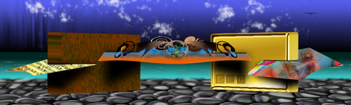
I'm glad I stopped by for a visit! Awesome work. My favorite is glossyorb I think. It looks like it is going to roll right off the screen. So shiny and eyecatching.
I'm also happy to see someone uses renders and photomanipulation. I love working with pictures as well. Maybe once I understand more of the plug ins and how everything works I'll get more into the abstracts.
It is a little intimidating to see so much great work that is made 100% PDN. You excel at both! Nice work. Thanks for sharing.
|
|
|
|
Post by TheBad1 on Aug 5, 2011 22:15:38 GMT
All stunning new work. Very stunning but the star of the show is your sig (plus avatar) I raved it when I saw it on the white background ... but on the red forum background - I'm jealous. That's the best sig I've seen. Totally love that. If you ever get stuck for an idea ... I'd love a sig like that  I'd wear it on both forums |
|
|
|
Post by heat stroke on Aug 16, 2011 17:35:39 GMT
Barbieq: Thank you! AFG: Thank you! Dug: Thank you! The stains and splatters were a combination of brushes and hard PDN work. BlackPenny: Thank you! Venicet: THank you! Im glad you stopped by as well! What a wonderful comment to read! I love photomanips, but I havent done any in a while... Welshblue:  Thank you very much! Do you think it is worth a tutorial? I wont make one if nobody would use it. I honestly think if I were to give you the tutorial, you could make something even more amazing! But I love the text you have in your sig right now! Updates:  > 90% PDN, 10% PS. I only used PS for the background. I used this Illustrator tutorial.  > Apophysis 7x, PDN, PS cs4. I used this tutorial as a starting point. |
|
|
|
Post by Leif on Aug 16, 2011 17:58:47 GMT
Wow, those letters look really cool. Also like the way you let the red lines extend beyond the letters. Somehow it creates a kind of "beyond" effect, if you know what i mean.
|
|
|
|
Post by Helen on Aug 16, 2011 18:59:43 GMT
The letters are quite cool, futuristic, very modern-looking. The way the pink lines outline the text is very nice. Excellent work with the red abstract! |
|
|
|
Post by barbieq25 on Aug 16, 2011 21:37:23 GMT
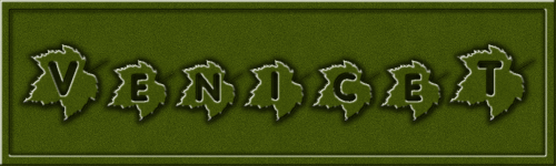
Text one is great. Great concept. The star of them is the red one - Eruption. It has a most wonderful feel to it. You did great with both of these.
|
|
|
|
Post by TheBad1 on Aug 16, 2011 21:49:51 GMT
My second time of writing this. Pro-boards server wouldn't let me in for an hour  Love the minimalism of the text one. Great background and I actually like the line colour. Maybe because it's more cerise, rather than pink ;D I can see molten metal in the abstract. Reallly nice. Me personally would love to see a tut for your sig |
|
|
|
Post by venicet on Aug 17, 2011 0:17:52 GMT
Awesome new works Heatstroke. Like everyone has said, the letters look really cool and futuristic. My favorite of the two has to be eruption. It's beautiful. I second the idea of a tut for your sig!
|
|
|
|
Post by AFG on Aug 17, 2011 5:43:10 GMT
I came across that Illustrator tutorial a few days ago and really loved the effect, you have done a great job with it. You are producing some great work with Apophysis the latest is no exception.
|
|
|
|
Post by Pixey on Aug 17, 2011 13:58:02 GMT
Jaw-dropping results HeatStroke Alien and Eruption are just so perfect in every way. Fantastic results. I've noted the rose tutorial .... looks very complicated  |
|
|
|
Post by heat stroke on Aug 17, 2011 17:43:54 GMT
Thank you Leif, Helen, Barbieq, Welshblue, Venicet, AFG, and Pixey! Your comments mean a lot! Pixey- it actually isnt that hard, once you start playing around. The hard part is stopping!  I have at least 20 different tweaks saved, and I dont know what to do with them! I have posted the tutorial in the Intermediate tutorials section. I posted it there because I feel that basic knowledge of PDN is required, but I may be wrong. If it belongs in the beginners tutorials, I will work something out with Lance to move it/delete it and repost it. Enjoy! |
|
|
|
Post by lancemcknight on Aug 17, 2011 23:27:18 GMT
No, your tutorial is in the right section. Generally, the more steps there are involved, the more likely it is an intermediate level. Here's a bit of trick, when creating an advanced tutorials, it doesn't always include all the steps, just enough to nudge in the right direction.
|
|
|
|
Post by heat stroke on Aug 18, 2011 12:23:19 GMT
Thanks for the tip!
|
|
|
|
Post by blackpenny on Aug 20, 2011 16:33:01 GMT
Amazing new works heat stroke! I can only echo what everyone else has said. I love the text with the little bit of colour , and the red one is beautiful.
|
|
|
|
Post by heat stroke on Aug 21, 2011 15:46:35 GMT
Thank you Blackpenny!
|
|


 Thank you very much! Do you think it is worth a tutorial? I wont make one if nobody would use it. I honestly think if I were to give you the tutorial, you could make something even more amazing! But I love the text you have in your sig right now!
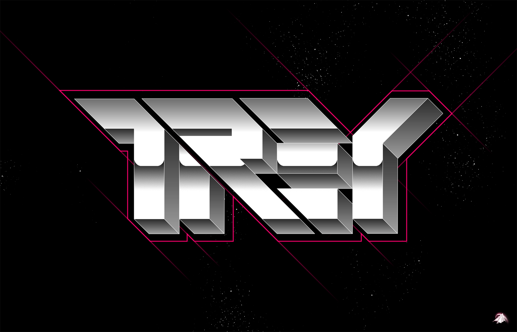


 "]
"]
 I have at least 20 different tweaks saved, and I dont know what to do with them!