|
|
Post by barbieq25 on Aug 26, 2011 11:40:13 GMT
WOW! Sargon what a happy image. The water & the rocks really tickle my fancy. The fish are so pretty & the plants too. I love the way the lights streams through the water. Should there be a bit of a shadow on the fish? You know - as if they were casting a shadow on the rock, plants & sand?
Love to know how you did those rocks - awesome! Also like your watermark a lot. Well done!
|
|
|
|
Post by venicet on Aug 26, 2011 18:11:18 GMT
well I"m glad I didn't get around to deleting the fonts from my computer. I was wondering if I'd ever actually use them. I guess I'll hang on to them a bit longer.
The new work is just wow! It's amazing what you can make PDN do. I could see that image being airbrushed on the walls of a room so you feel like you are in the water with the fish. The ceiling could be painted like the top of the water. Of course I'd never get anything done in that room because I'd be sitting looking at the walls! So peaceful and relaxing.
|
|
|
|
Post by Sargon III on Aug 27, 2011 5:20:36 GMT
barbieq25, thank you very much, appreciate your feedback. About the shadow, there is actually a shadow for some fish and plants, but it isn't dark enough, do you think if I make it darker will look better? I noticed the fish are mixed with the stones, couldn't find a good way to make them more noticeable, I added some drop shadow around them, but didn't look good. And about the stones, there is a written tutorial in the old Fans forum, I will try to find it. But you can check this video tutorial for the stone as well, funny it is on how to make an asteroid. When you open the tutorial video, click also down on the " Show more", there is two more parts with a different method and detailed to make the stones, as I remember I put them on non-searchable option on YouTube to get less views, because they are asking to put advertisements on my videos, but I really don't like adds covering half of the screen even if they pay a fracture of a penny on each view. venicet, Thank you very much for your feedback, I like your description on the image. If you think that you have many fonts on your PC that make it slow, then turn the fonts that you like into brushes individually, just type a large shape on a canvas (about 500x500) with black and save the file as PNG, then install and use them with Simons Brown MiniBrush plugin.
|
|
|
|
Post by AFG on Aug 27, 2011 7:27:49 GMT
The sand, water and lighting are fantastic, the one thing that is playing on my mind is " movement", the fish are all side view, one or two turning or head on view would bring life to the shoal, the plant life also looks a bit 'solid' rather than flowing and moving with the water currents, but without a doubt it is an image that makes the viewer smile because it has a fantastic "Happy, feel good Factor" ;D
|
|
|
|
Post by Pixey on Aug 27, 2011 8:19:02 GMT
What a lovely, calming and tranquil scene  Those are happy fishies. I too love the way the light shines through and the rocks are superb. I must give that tut a try  |
|
|
|
Post by barbieq25 on Aug 27, 2011 11:25:58 GMT
Well, more often that not fish do tend to blend in with the environment. I did see some shadows on some of the fishies. Perhaps making them darker would be good. Sometimes the more real you try to make it, the more it loses the "feel".
The entire image is so happy. I really like the way you did the fins on the fish too.
|
|
|
|
Post by Helen on Aug 27, 2011 16:02:08 GMT
Oh wow. I'm in shock...awe, whatever you want to call it. This is extremely phenomenal! The fish, the rocks, the reefs, the way the light shines on the rocks, the grainy sand, and the water itself are astounding! And not only that, you added shadows in such a way where it creates the correct perspective and depth to the beautiful image. You'd strike it rich if you were to sell this.
|
|
|
|
Post by Leif on Aug 27, 2011 16:22:18 GMT
|
|
|
|
Post by TheBad1 on Aug 27, 2011 20:19:41 GMT
Very nice mate  My first thoughts were ... what a great Apng this would be. Even if it was only the plants swaying slightly Brilliant mate. I love the stones, the light rays, the top of the sea and how you've given it great depth (no pun intended) the way you've done the sand going into the distance. Stunning. If I were to critique ... maybe a bit of simulated movement behind the fishies ? But I love it either way |
|
|
|
Post by Sargon III on Aug 29, 2011 1:40:43 GMT
@ AFG, Thank you very much, you are right, I tried the fish facing the camera but didn't work with me, I added some in this version, but they look funny, and I waved the plants, they look much better now. Pixey, thank so much, I am glad you liked it . barbieq25, thank you barbie, the fins in some fish are smudged directly from the body texture, but in some others I sued a different method, BTY, I darkened some of the shadows and I like them. Helen, , thanks you very much, sell it? Well never thought about that. Leif, lol thanks, realistic but from another planet. TheBad1, thank you welshy, if I animate it the file will be huge, do you have any idea on how to make the movement behind the fish, couldn't achieve that effect, I really like to add some movement but don't know how. I saw your rusty image, and tried the effect, the displacement plugin was so useful. Added some more fish and waved the plants. 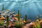 Rusty with and without cracks, inspired by welsys last work:   |
|
|
|
Post by barbieq25 on Aug 29, 2011 9:04:25 GMT
Oh what cute fish you've added! Much better I think with the more colour in the fins/gills & the different perspectives. It really has much more of a 3D look now. I like Welshy's idea of a APNG too.
The rust ones look great & the one with the cracks is the pick for me. Looks like we have a bit of lichen going on there too. Lovely work!
|
|
|
|
Post by blackpenny on Aug 29, 2011 14:13:51 GMT
Under-water is such a cute, happy image. I like the second one better with more colour and movement.
The rust is great too. I like the one with cracks better. Now I'm going to have to try it too.
|
|
|
|
Post by Helen on Aug 29, 2011 15:37:32 GMT
The rust texture is just as amazing as Welsh's. I think I've actually seen something like this on the beach.
|
|
|
|
Post by AFG on Aug 29, 2011 18:52:22 GMT
Sargon mate those fish don't look funny, they look perfect, I love the expression on their faces, like they have just realized they are being watched. I am also laughing because I have spent two days painting a rusty , blood splattered blade that I was happy with and both you and Welshy have produced fantastic rust work.
|
|
|
|
Post by TheBad1 on Aug 29, 2011 20:59:27 GMT
Flicking between the 2 versions ... I've just realised how huge an .apng would be  Would look awesome though Excellent changes and additions. I agree the fish facing front on don't look strange at all. They definitely enhance the image - as does the movement on the plants. Simulating movement ... hmmm ... I'll get back to you mate BTW - hope you don't mind, but I've just set the second version as my wallpaper - on my wife's orders Edit*** I forgot to say how amazing those 2 rust images are. Awesome mate. Both are winners in their own rights for me. Brilliant textures Clouds, Chad's concrete tut' (sometimes inverted ), Displacement and standard Blend Modes ... and a lot of luck does it for me ;D |
|
|
|
Post by AFG on Aug 30, 2011 11:31:43 GMT
I was just compairing the two rust textures produced by yourself and Welshy and it was interesting to notice that you have been working on an underwater scene and the texture of rust reflects that , where as Welshy has been working on a car image and his style of rust is more industrial |
|
|
|
Post by Goonfella on Sept 3, 2011 6:22:45 GMT
Outstanding image mate! Nice and colourful, so much detail and a joy to behold. I think the changes you have made make it look even better . If there is one thing I would pick up on its the rocks. They all look a bit too similar and I think there needs to be more with jagged edges. But that`s just a small thing.Wonderful image. As for the rust - looks great. Although seeing how rusty that metal is maybe one or two larger cracks radiating out from where the bolts are would look good. That would be a weak point in the metal and would most likely be more susceptible to cracking. |
|
|
|
Post by moninca on Sept 6, 2011 1:44:12 GMT
I went back through your thread to find the earlier version of Underwater. The recent one definitely has more life and color. Very nicely done, especially on the fish and coral. |
|
|
|
Post by Sargon III on Sept 7, 2011 0:33:54 GMT
barbieq25, Thank you very much, what you have mentioned on the rust is correct, glad I got that effect  blackpenny blackpenny, Thank you very much, usually I start the rust with Clouds (dark red and yellow, picked from the default color palette) Helen, Thank you and you are right, it is rusty from ocean salty water . AFG, thank you very much mate appreciate your comment, my rusty image came when I was cleaning the water bed, but I don't know where Welshy got his rusty image from, hope wasn't under the tires ;D. TheBad1, thank you very much, I was trying to animate a fish then got lost lol, so many layers, especially when I was making the fish go behind the rocks or plants, so I quit. And I use almost same effects for the rust but not Chads concrete, good I idea to try that as long as I have it as a Script file. Goonfella, thank you very much, someone also, mentioned same thing about the rocks been so smooth on the vid tut , that's why I thought to use them under water, it is a good point, I have to try to get a more jagged edges, may be a different shape brush? I am not sure if it is possible to add a brush to liquify plugin, didn't check yet. And large cracks starts from the bolt holes is a great idea too, I still have the PDN file I see what can I get. moninca, thank you very much, that's why I post the WIPs for feedback. Was trying the diamond after seeing Venicet attempts and got this, then added the metal work, don't count me on this, it was a quick work. Scorpion Brooch 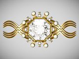 Then I made a search for a real facet diamond cut in Google, then got the outlines from Google SketchUp warehouse, luckily there were some few ones, then downloaded one and set the angle, then selected every part one by one individually and applied a gradient with black and white (time consuming work), then some color balance and got this, not bad: 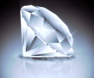
|
|
|
|
Post by Helen on Sept 7, 2011 0:38:02 GMT
Oh, goody, goody. Quick work you say? Gee, I only wish I could create something as beautiful as this.
|
|
|
|
Post by venicet on Sept 7, 2011 3:00:58 GMT
WOW! I didn't get anywhere near as nice as yours! perhaps a tut on the diamond??? Google Sketchup? gonna have to go Google that now LOL
|
|
|
|
Post by Sargon III on Sept 7, 2011 7:03:18 GMT
Helen, thank you, the metal is a little bulky. venicet, thanks, well the procedure is easy if you have the outlines, there isn't really any special steps for a tut, I am attaching the outlines for the front and back faces exported from Google sketchUp, you can use them to try the method: 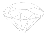 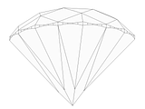 What I did actually is just filled every polygon after selecting it -with Magic Wand on same layer- with B&W gradient for the front face, and with solid gray or white for the back face in Paint.NET, then put the back on top and reduced the opacity. Almost like this video tutorial: www.youtube.com/watch?v=qoC4wbfZP7s
|
|


 Those are happy fishies. I too love the way the light shines through and the rocks are superb. I must give that tut a try
 "]
"]


 "]
"]


