|
|
Post by Sargon III on Jun 17, 2012 8:27:21 GMT
Awesome mate, love the background, wherever I look I see something I love, I am almost hearing the conversation between the two beautiful birds through the trickling, the light through the tunnel is amazing, don't mention the tunnel itself, the most I like is the left-top tree on the step and the cave behind, so dramatic.
Can't wait to see the final work, it is turning to a very beautiful painting, I think I like the skin tone as it is.
|
|
|
|
Post by TheBad1 on Jun 17, 2012 14:38:24 GMT
I can only agree with the plaudits lay down by everyone else. Everything is blending together very nicely but I've one thought which ordinarily wouldn't concern me, in fact would be one of the crowning glories ... the blue light.
Half of my brain reads it as- 'the light at the end of a tunnel' ... the other half - 'don't go into the light '
Quite possibly it's my messed up head ?
|
|
|
|
Post by TheBad1 on Jun 18, 2012 21:39:51 GMT
Having re-read my above post it may come across as a bit of criticism but really wasn't meant to be. Maybe a bit of tiredness and over analysing when I looked at it. I'm still divided but just wanted to say it's a fantastic piece either way  |
|
|
|
Post by AFG on Jun 19, 2012 10:09:36 GMT
@ Sargon: thanks mate, I am trying to create separate areas of interest with in the painting but have them blend together as a whole to create an over all effect of peacefulness and tranquillity. I am hoping that when it is displayed at full size ( 5826 x 3600 @ 72p/i just now but when increased to 300 p/i will allow a print size of up to 24000 x 15000 ) these areas will become more apparent.
@ Welshy: mate the whole point of posting the work is to hear the thoughts you all have on it, the diversity of artistic styles, cultures and perspectives with in this small group means that not only is the feedback helpful but it is also unique.
Goonfella views the skin tone differently from Sargon, I agreed with Goonfella but , having read Sargon's comment I am now asking myself was it an artistic decision I was making or one based on the fact that over here we have two seasons in a year, COLD and I AM NOT GOING OUT IN THAT. So now I will probably adjust the skin tone to somewhere in the middle.
Your comment about the blue light I found very interesting, I am wondering if because you are aware of where it will be displayed and the reasons behind it, if good old natural instincts kicked in there, great comment because it makes me aware of how others may view it.
|
|
|
|
Post by Sargon III on Jun 19, 2012 23:52:11 GMT
Thanks mate,  24000 X 15000 that is huge, I am not sure about some areas will become more apparent if you increase the DPI, as I know if you increase the DPI you are actually shrinking the print size, unless you already had started with a canvas dimensions of 24000 X 15000pix with 300 DPI (doubt my PC could handle it) that will give you a super clarity print of 80x50 inches, I hope one day we will have some programs could do that by increasing the DPI and the size simultaneously won't blur the image, I might didn't understand you, but I am sure the quality that I am seeing is very good according to the current dpi and dimensions that you are working on. And about the skin tone degree, it really doesn't matter that much on the subject woman, but in my opinion the tan skin could handle the reddish more than other skin types, the reason I am saying this is to achieve the equilibrium between the background and the main subject, the contrast of Blue/Green is the red, if I am not mistaken. |
|
|
|
Post by AFG on Jun 20, 2012 11:47:55 GMT
@ Sargon: apologies mate I did not explain size/resolution properly from a PSD view. As you correctly say in PDN increasing the DPI will result in a decreased print size, however when I change the PPI (pixels per Inch) in PSD and use the resample function the print size remains the same but PSD automatically increases the canvas size to what it would be if I had been working at 300 ppi. This in effect means that at present the picture would print out at 5826 X 3600 with 72 ppi with a very good chance that colours, edges etc would be blurred due to only 72ppi, by increasing to 300 ppi PSD takes the size up to 24000 X 15000 but keeps the original print size so now when printing instead of 72 ppi it will print out at 300 ppi. The danger with this is it means relying on PSD to re-sample the colours accurately, to ensure the colours are 100% accurate I will use a PSD plugin called Genuine Fractuls from onOne Software, heres a link if you want to have a look at it Software LinkI should also mention that printing is done directly from the PSD file and not from the picture saved as a jpeg, png etc. The point you make about the skin tone is the reason I was questioning myself as to whether I would be adjusting it from an artistic point of view, it’s also the reason I appreciate all the feedback as it gives me lots of food for thought. |
|
|
|
Post by TheBad1 on Jun 22, 2012 21:45:45 GMT
Your comment about the blue light I found very interesting, I am wondering if because you are aware of where it will be displayed and the reasons behind it, if good old natural instincts kicked in there, great comment because it makes me aware of how others may view it. I think my comment was based entirely on where this is going to live & grace the walls. Maybe I can be too over analytical @ times. Actually I know I am. I prefer to think of it as an occupational necessity which I never switch off from; rather than OCD  At the end of the day the finished image is going to be a lot larger and then the blue light is going to take on a significant different look. The water is excellent. Very tranquil and believable. Another truly great piece mate Your generosity in brightening up the lives of everyone there is what counts.  |
|
|
|
Post by AFG on Jul 3, 2012 23:21:54 GMT
The painting is now basically finished, I have made a few changes, taking note of the suggestions made.
@ Welshy: I have done a bit off work on the tunnel and I like it better now.
|
|
|
|
Post by Helen on Jul 4, 2012 0:29:42 GMT
|
|
|
|
Post by AFG on Jul 4, 2012 7:53:17 GMT
If I were to paint this--I'd probably make the butterflies different colors especially the ones up closest just to variate the colors. Must admit it is a thought I have had, the reason behind having them the same colour was to create rhythm to draw the eyes across the work, I think I might add a contrasting colour to them, the rock texture is create using a modified chalk brush and then going back over with the spatter brush, then altering the opacity. During the sketching and painting of the fabric folds the inside of my house looked like a towel shop as I had large bath towels hung up around the place to use as references, thanks for the comment and input Helen  |
|
|
|
Post by TheBad1 on Jul 4, 2012 23:11:36 GMT
How hard would you hit me if I said I preferred the original blue light ?
Joke. Much, much nicer mate.
Although if the wings are there, maybe they're a tad too high ?
The foliage and supporting trunks are superb.
Absolutely phenomenal job on the robe. Maybe the flutterbye could be moved across a bit ? Giving some nice reflection in the water ??
Love the rock texture
|
|
|
|
Post by blackpenny on Jul 5, 2012 14:34:14 GMT
Beautiful work!
I've been reading some books about Leonardo da Vinci, one of them has studies of fabric folds. So lately I find myself looking at fabric folds. Not that I have any plans to draw them, just that I find it fascinating. For the moment.
|
|
|
|
Post by Helen on Jul 5, 2012 18:09:43 GMT
Speaking of fabric folds, my brother (who's the better artist than myself) made a window-type frame where he hangs fabrics on it for reference. I usually use what I have in my room and then take pictures of it using my cheap Web cam.
|
|
|
|
Post by AFG on Jul 6, 2012 6:36:51 GMT
How hard would you hit me if I said I preferred the original blue light ? If you are anything like the Welsh boy's I have met on the rugby field it wouldn't matter, many's the time we fought ourselves to a stand still then went on to sing and drink the bruises away at the bar ;D @ Penny: I love reading books that deal with da Vinci's work, such a fascinating character and words cannot describe the admiration I have for the artistic skill he possessed. @ Helen: It would be great to see some of your brothers work. Here is some close up's of the work. 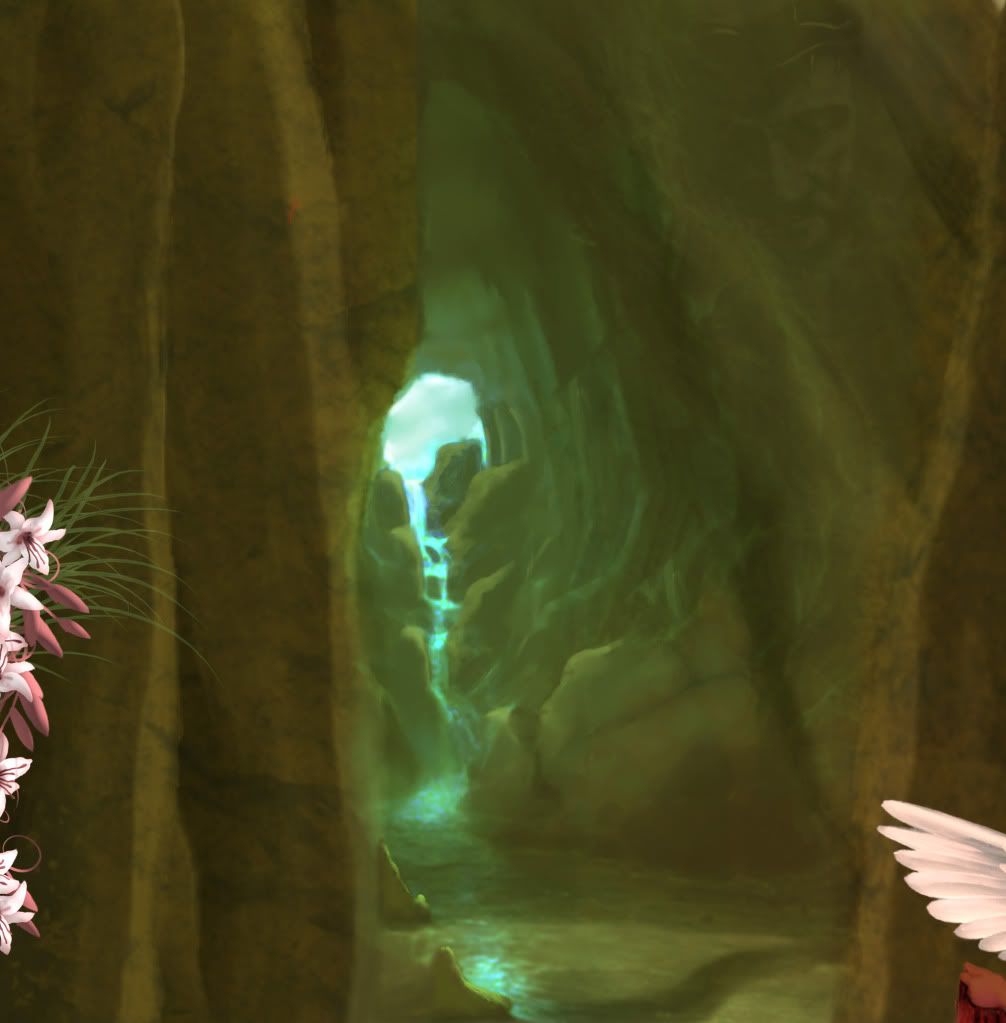 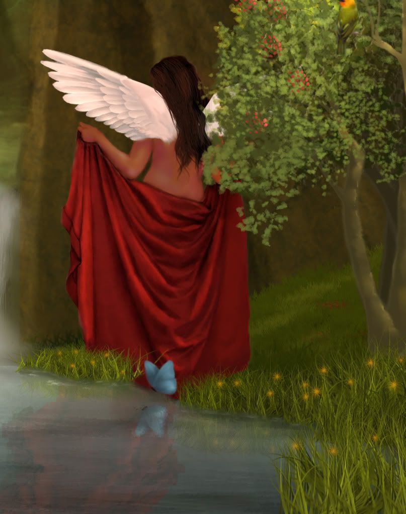 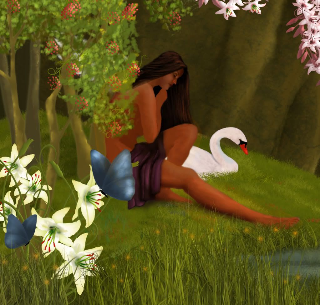 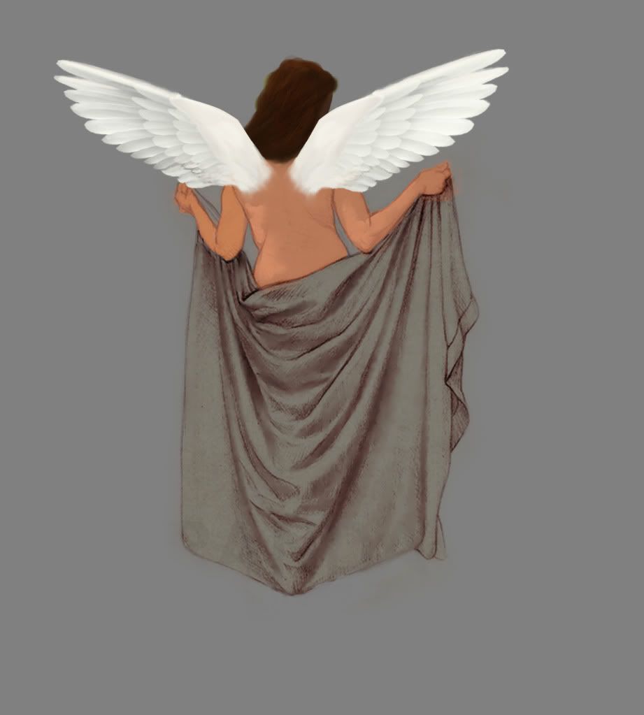 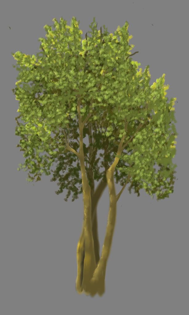 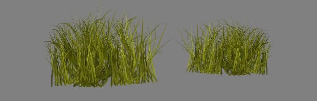 And this is the start of a new work, she will be called Áed, I am using Paint Tool Sai on this one. 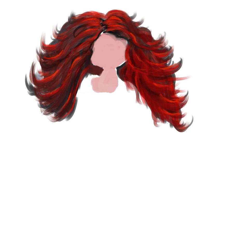 |
|
|
|
Post by Pixey on Jul 6, 2012 9:47:27 GMT
Thank you for posting the shots of the trees, the lady and the main scene - I just love the fine detail you put into the work. All the shades and high lights are so fine and must take ages to do. WoW! Aed looks like one hot MaMa and I adore her hair |
|
|
|
Post by Goonfella on Jul 6, 2012 10:56:43 GMT
Wow! Amazing detail in everything - especially the trees and grass . I love the close up of the cave . The lighting is great. I still think that the fairies are a bit too suntanned. I would not have their skin pale white , just not quite so brown. But that`s just my preferences so it`s not a criticism or anything. How can work like this be criticized anyway? Great stuff AFG. |
|
|
|
Post by barbieq25 on Jul 9, 2012 21:14:27 GMT
I was thinking the same thing, Goonie about the tan. They could be Aussie fairies with that tan. But on the other hand, on a larger canvas it probably does not look as dark.
I adore the cave too. Each element looks fabulous & I am so glad you shared this lovely image with us AFG. Really beautiful work!
|
|
|
|
Post by AFG on Jul 13, 2012 9:56:24 GMT
WoW! Aed looks like one hot MaMa and I adore her hair Thanks Pixey, your right Áed is Gaelic for fire @ Goonfella / Barbie: one of the biggest factors that is making her skin appear darker is the white swan, the one thing I didn't want to do was stick with convention and give her the usual porcelain skin so I decided to go the complete opposite but still keep a balanced contrast During working on Áed I got to thinking about where she would live and kind of veered off and began creating an environment for her, I have attempted to do this painting in an illustration style using mainly very desaturated colours. 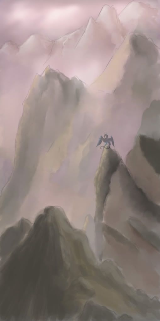 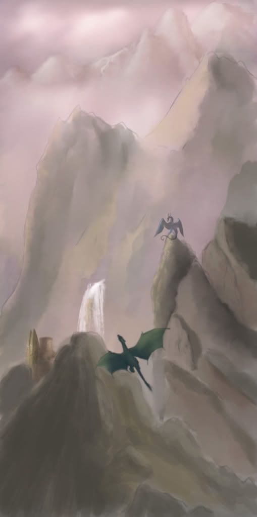 |
|
|
|
Post by barbieq25 on Jul 13, 2012 13:48:22 GMT
I love them both! Very nice work. I like the soft colours to contrast the harsh environment. Flying dragon is a lovely touch. Well done!
|
|
|
|
Post by TheBad1 on Jul 13, 2012 20:16:12 GMT
How hard would you hit me if I said I preferred the original blue light ? If you are anything like the Welsh boy's I have met on the rugby field it wouldn't matter, many's the time we fought ourselves to a stand still then went on to sing and drink the bruises away at the bar ;D As a football fan I've got to admit that rugby boys can take the higher ground on that. Shake hands and it's all forgotten; whereas football boys and supporters never forget. Sometimes to the detriment of the game  Love the start of Aed ... my wife said ... " I love that hair ..." Awesome background springing up. The desaturation works a treat. Brings Boris Vallejo to mind. A work of art in themselves, mate. I feel quite jealous you draw dragons so much better than me  BTW ... how do you get gaelic symbols like above the A. ? It feels wrong when I write Welsh words without the accents |
|
|
|
Post by AFG on Jul 15, 2012 6:16:25 GMT
@barbie: it really started out as practise for mountains and rock but I liked what was there so have continued to add to it.
@welshy: I have always found it strange how Wales and England have dragons in history and folklore yet Scotland doesn't really. We have the word Beithir which can be used for wild beast or serpent but mainly is used for great bear.
To apply the Áá hold down Alt Gr on your keyboard, it normally sits immediately to the right of the space bar.
|
|
|
|
Post by Helen on Jul 15, 2012 17:56:00 GMT
I really like your mountains--they have such great texture and shape to them. The fogginess really gives it a complete look. Everything looks superb! |
|


 24000 X 15000 that is huge, I am not sure about some areas will become more apparent if you increase the DPI, as I know if you increase the DPI you are actually shrinking the print size, unless you already had started with a canvas dimensions of 24000 X 15000pix with 300 DPI (doubt my PC could handle it) that will give you a super clarity print of 80x50 inches, I hope one day we will have some programs could do that by increasing the DPI and the size simultaneously won't blur the image, I might didn't understand you, but I am sure the quality that I am seeing is very good according to the current dpi and dimensions that you are working on.


 "]
"]

 "]
"]


