|
|
Post by Helen on Jun 17, 2011 20:47:29 GMT
I agree with Welshblue. The blending is just beautiful.
|
|
|
|
Post by barbieq25 on Jun 17, 2011 22:48:28 GMT
Aside from the text issues (the idea is great), what I really like about this one is the colours & the way you merged all of the images together. The stadium makes an excellent frame. I really don't know anything about footy so please forgive my ignorance but are the figures on the right (light grey ones) former players from like yesteryear? I looks like they are ghosts watching over the other players & the game.
Pretty darned fantastic the way you've done this compilation. I love it! Well done & great to see you back.
|
|
|
|
Post by AFG on Jun 18, 2011 8:08:33 GMT
I was in the middle of commenting yesterday when we had a power cut  , anyway it's not 'crap' mate far from it, photomanips are very difficult to do. I love the idea behind this, the mix of past and present, what I was thinking when looking at it is if you were to reduce the size of the past players/managers and fade them a bit more it would push them back more and give a bigger feeling of walking through time/history. |
|
|
|
Post by Manc on Jun 18, 2011 10:12:49 GMT
Thanks Welshy,I agree about the text but not the final.We should've won by more,bit've jealousy creeping in there mate.  Thanks Helen. Thanks Barbie,always nice to hear from you. AFG.Thanks for your comments.It is just something I threw together to get me back doing something. Seemed like the longer I left it the harder it was to get back into the groove,if you know what I mean.  Hopefully I'll get back into it now,coz I do enjoy it, as we all do. Same as City,onwards and upwards.  |
|
|
|
Post by Manc on Jun 19, 2011 16:34:40 GMT
I'm gonna get back to doing the house I spoke to Barbie about.Anyway,here's the front door,no points for guessing what it's based on. |
|
|
|
Post by AFG on Jun 20, 2011 6:12:02 GMT
If the rest of the house is as good as the door it going to look great.
|
|
|
|
Post by Pixey on Jun 20, 2011 7:29:56 GMT
Well, if this is something you just 'threw together', then can't wait to see what you do when you really get down to it ;D Seriously, the door is fantastic. So sorry to hear you have not been well. Hope you feel better real soon  |
|
|
|
Post by barbieq25 on Jun 20, 2011 8:47:30 GMT
The door is looking grand!
|
|
|
|
Post by an evil guy on Jun 20, 2011 8:47:44 GMT
nice door looks great and its the little thinks that makes it stand out like the mettal effect on the fixtures and all the little shadows nice work as for the manchester city one well i live in newcastle upon tyne ;D nah its looks awesome if your up for it make me a NUFC like that |
|
|
|
Post by Dug on Jun 20, 2011 9:19:51 GMT
The door is looking good, keeping an eye out for what is coming next.
|
|
|
|
Post by Manc on Jun 20, 2011 13:15:03 GMT
Thanks for your kind comments everybody.I actually did the door ages ago,I got hung up on doing a bay window,think I'll leave it. Thanks Pixey,not really been unwell,just usual manic,meds don't agree with me,;YES WE DO; ;Dgonna get off them. AEG,no probs mate,I'll do an NUFC if you want.Did'nt you win the Championship a couple of years ago?I'll do one based on that. |
|
|
|
Post by Manc on Jun 20, 2011 16:25:22 GMT
Just been looking at City thing.Bloody text is atrocious,I'll fix it.
|
|
|
|
Post by Helen on Jun 20, 2011 16:30:04 GMT
Oooohh...the door looks really nice. I like the design.
|
|
|
|
Post by Leif on Jun 20, 2011 16:46:25 GMT
Great work using a slight gradient several places. That is the details that really makes it look great.
|
|
|
|
Post by Manc on Jun 21, 2011 10:11:16 GMT
Thanks Helen and Leif. It's good to be back.Got a few things to do now. Sort out the text on City,do A Newcastle thing for AEG and build a house. :)Should keep me busy for a while. |
|
|
|
Post by Manc on Jun 23, 2011 13:14:15 GMT
I've changed the bottom text cos it was crap,"not much better now" I hear you say. The top text I can live with.Anyway it's finished now,I'm not messing with something that was only a stop gap to begin with |
|
|
|
Post by TheBad1 on Jun 23, 2011 17:57:46 GMT
Nice job on the door ... maybe not my choice of blue  Great reflections on it |
|
|
|
Post by Manc on Jun 23, 2011 19:04:07 GMT
Thanks Welshy,it's the correct shade of blue,get used to it,youre going to be seeing a lot of it. I learned the text technique of you anyway, so cheers for that . |
|
|
|
Post by blackpenny on Jun 24, 2011 18:56:40 GMT
Good to see you back Manc! I've been sort of away too, I know what you mean about getting back into the groove.
I like the City piece, nice blending of images. The door is really nice too. I like the colour, and it means nothing to me in the way of sports, I just like it.
|
|
|
|
Post by Manc on Jun 25, 2011 18:50:05 GMT
Well, welcome back BP.I do think it's hard to get back if you leave it for a while.Saying that, everybody is so friendly and supportive,it's easy to start again. I've got a new idea for a pic,based on Sargon's ripple.I've stopped taking the meds so I'm ok now. Probably |
|
|
|
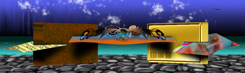
Post by Manc on Jun 28, 2011 18:13:20 GMT
Thanks to Sargon for the tutorial. |
|
|
|
Post by Helen on Jun 28, 2011 18:18:13 GMT
That is so, so awesome! I haven't seen anyone put something inside a ripple like you did. Wow. And great job on the color scheme, too. Really nice!  |
|


 , anyway it's not 'crap' mate far from it, photomanips are very difficult to do. I love the idea behind this, the mix of past and present, what I was thinking when looking at it is if you were to reduce the size of the past players/managers and fade them a bit more it would push them back more and give a bigger feeling of walking through time/history.


 "]
"]