|
|
Post by martel on Jan 22, 2011 5:56:59 GMT
I haven't found a workbench in here yet. Can somebody give me a nudge I am trying to get this to look more steely. Have tried Alpha Displacement Bevel curves brightness  |
|
|
|
Post by peterpawn on Jan 22, 2011 6:01:11 GMT
Try gaussian blur at radius 2, then Photo/metallize. I haven't tried that but it's where I might start.
|
|
|
|
Post by Goonfella on Jan 22, 2011 6:46:36 GMT
How about selecting the text , adding some noise with 0 colour saturation. Then use Motion Blur at a fairly high setting and your preferred angle.
Then I would use the AA plug in to smooth out the edges of the text then Metallize, as Pete suggested. You can try refining the Metallize effect a bit using Curves as well.
|
|
|
|
Post by martel on Jan 22, 2011 7:17:09 GMT
PeterPawn Goonfella Thanks for the replies. The blur plus metalize  |
|
|
|
Post by martel on Jan 22, 2011 7:26:51 GMT
The noise, blur, curves sounds like a road race  |
|
|
|
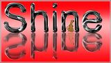
Post by Pixey on Jan 22, 2011 18:01:16 GMT
Is this what you were wanting?  I did all of what you tried, GB, AntiA, Bevel plus the feather plug-in. Then duplicated the layer & used metallize and played a bit with the settings. Then a bit of lightness in Adjustments. Hope that helped  |
|
|
|
Post by Ella on Jan 22, 2011 19:12:16 GMT
|
|
|
|
Post by martel on Jan 23, 2011 2:03:52 GMT
|
|
|
|
Post by peterpawn on Jan 23, 2011 2:22:59 GMT
Here's another idea.  I used this method in this image.  Basically it's just a white to gray gradient with noise added and the brightness adjusted. |
|
|
|
Post by Helen on Jan 23, 2011 3:58:29 GMT
Yeah, I think that the "noisy" texture makes it more steel-like.
|
|
|
|
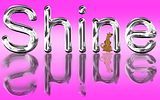
Post by Sargon III on Jan 23, 2011 4:12:58 GMT
Is this chrome effect something close to what are you trying to achieve? Click moving text for full size |
|
|
|
Post by martel on Jan 23, 2011 5:11:36 GMT
I really like that image
|
|
|
|
Post by martel on Jan 23, 2011 5:13:26 GMT
 Yes that is what I am trying to master. Yes that is what I am trying to master.
It is very hit and miss
I am thinking my letters are too wide
That looks like the top layer Xor |
|
|
|
Post by Sargon III on Jan 23, 2011 5:40:56 GMT
They are both same technique, Splinter blur, Alpha Displacement and metallize, but in the 3D-TEXT I repeated it twice on two layers.
Open them on a white background for better view.
|
|
|
|
Post by martel on Jan 23, 2011 5:50:07 GMT
Splinter blur
|
|


 "]
"]


 "]
"]