|
|
Post by TheBad1 on Jan 11, 2011 23:08:48 GMT
After a bit of interest in the technique I used in this image, I've knocked up with quick tut' ...  This is just a quick how to ... I added many more layers and different Blend Modes ... all in all about 80 layers but hopefully this will get the jist of the technique across Many thanks to Chad for his invaluable, versatile Concrete tut ... Click Using this is optional, but I find it gives more interest to the base metal Plug-Ins Needed: Multi Colour Gradient . Not sure if Align Object is standard now or a plug-in ... but you'll need it 2. Adjustments >>> Make Black and White Playing with different Blend Modes Enjoy and play around with all the settings I've posted. It's surprising how varied the results can be. Whether they look good or not is down to you, the individual ... |
|
|
|
Post by oma on Jan 12, 2011 3:25:30 GMT
glad you added this one! it is one of those I'd on my list to try out this month and I hadn't a chance to copy to pdf format for a good study and think and apply OMA style.
ciao OMA
|
|
|
|
Post by barbieq25 on Jan 13, 2011 14:14:00 GMT
Thanks Welshy. Didn't quite get your outcome but pleased with the results. I've done with this one but not too happy with the outcome on the other one yet. Thanks so much for the tute! 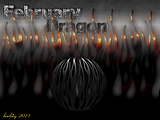 |
|
|
|
Post by Ella on Jan 13, 2011 15:13:59 GMT
This is one of my favourite tuts for sure  . You have probably seen this, one of my first projects I posted in public, the logo I did for competition using your tutorial.  |
|
|
|
Post by blackpenny on Jan 14, 2011 16:12:22 GMT
Here's what I did. I have a couple other versions, but I like this one best.
|
|
|
|
Post by Manc on Jan 14, 2011 22:42:42 GMT
One of my favourites too,had a lot of fun messing with this one.  |
|
|
|
Post by barbieq25 on Jan 14, 2011 23:11:24 GMT
I like your outcome Ella. It reminds of of a great 3D sign like you'd see in a shop. The red bits work very well in this image.
Blackpenny, I like the outcome too. The engraved part is very well done, the font style is great for this. Also the circle inside the oval looks good.
|
|
|
|
Post by blackpenny on Jan 16, 2011 17:32:28 GMT
Thanks barbieq. I figure Welshy's using a Celtic font, so I went for Germanica, since my family is mostly from Germany!  |
|
|
|
Post by barbieq25 on Jan 16, 2011 21:37:27 GMT
Really? I didn't know that - I was born in Germany. Emigrated when I was 8.
|
|
|
|
Post by blackpenny on Jan 17, 2011 0:11:39 GMT
My dad's parents and sisters were born in Germany, Dad was born in Canada. Mum's family came from Germany too, but I don't know if it was her parents or grandparents.
|
|
|
|
Post by blanco111 on May 25, 2011 4:19:50 GMT
This was a great tutorial with very satisfying results even for a beginner. I used shape 3D for the first time to turn my engraved, pitted metal sheet into a box. I lowered the opacity on the engraving because I thought it looked more natural that way. 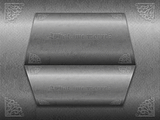 Thanks for posting this tut. |
|
|
|
Post by delpart on Dec 14, 2011 19:12:07 GMT
Well I really went down the rabbit hole with this one. Got lost three times trying to make a different background effect, then a day spent trying to create various forms for the knot work. Eventually stopped with a simpler form that was a little wide for the effect in some ways to have a nicer illusion. So I combined a recent heavy emboss tut from YM that I looked into and combined the two. And I'm sure its been mentioned (and commented on by you on the main forum) but I struggled a little with the instructions and the limitations of how magic wand works. Had to try and clean up edges three or four times etc after filling to get it work. In hindsight I needed to do some more gradient work as well with the main image to get an effect but I'm done beating myself up over this one for now. Just me beating me up mind you. The method is strikingly well conveyed for all that, just the inexperience on my part and easy distractions made me want to stop on it. This tut with some liberties on the coloring and spacing of the highlight/shadow layers: 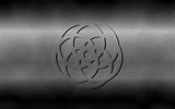 And my combination: 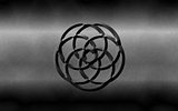 As always, thank you for sharing the insight as I've learned several things from this. |
|
|
|
Post by Helen on Dec 15, 2011 1:45:19 GMT
I like this tut. I had a little trouble doing the engraved/embossed look. This tut is helpful.
|
|
|
|
Post by Goonfella on Dec 15, 2011 6:56:59 GMT
At stage 10 you say `add 3 new layers in this order' but you don`t actually say what order. Just thought I would mention it. Great tut.  Nice outcome Del. |
|
|
|
Post by barbieq25 on Dec 18, 2011 7:06:52 GMT
I tried this one but got stuck somewhere along the line. I'll give it another go because the outcomes are so darned good!
|
|
|
|
Post by TheBad1 on Dec 18, 2011 20:33:15 GMT
@ Del ... nice outcomes. The magic wand isn't the best way, but I find some AA-Assistant then Old Feather by BoltBait gives decent edges @ Goon' ... you're right. Damn. I'll sort it out when the holidays start @ Helen and Barbie' ... I'm sure your outcomes would be as fantastic as per  |
|
|
|
Post by delpart on Dec 18, 2011 21:15:02 GMT
Ah, so then I need to start a separate question post then on how to copy/replicate and color, the coloring being key, anything black on transparent. Getting the other two layers colored in grey and white based off my self made font image was the problem. I had hoped it wouldn't be like color fonts.
(Yes, I've seen where this is covered in various text tutorials but I'm missing something about how PDN works here.)
To clarify: the reason I used magic wand was I cant seem to color things that are pure black on alpha. Or pure white for that matter. I'm either missing something or need to read up on this somewhere to better understand what is happening.
I just got old feather this morning so I'll have to try it out. I can already see where it can control the shrinking/growing problem I run into ...
(AGH, still looks like a hijack attempt. Honest. I'm not wanting you to fly me to Cuba. ...)
|
|
|
|
Post by Helen on Jan 10, 2012 15:55:06 GMT
Welsh (or anyone else), this might be a silly question to ask, but I'm kind of having trouble "engraving" a button inside a flat piece. I want to know how to do an effect like this: HEREI know that Goon did several interfaces, but I just can't seem to get the shadowing right. It seems off. Here's my attempt: HERE |
|
|
|
Post by delpart on Jan 10, 2012 17:25:10 GMT
Well, the technique I used in my avatar my be helpful as its a little different ... If I recall (I really am kicking myself for not saving the history on that one) it was combination of really slight embossing (PS Emboss, better angle control and depth control) and splinter blur on a drop shadow created of the letters with the preserve image turned off , then merged into the embossed plate and placed underneath the DP letters to create my shadows. In hindsight I think I could have done something with smudging to have avoided the somewhat obvious right angle highlights ... (sorry for the description but I'm pretty ill atm. cant talk without transposing words, but I can type, sorta ... have to love side effects ... **EDIT: 37 typos in spell check, nope, I'm not on top of it yet) Obviously splinter blur can create right angles etc. Radial blur may work better considering ... or a combination. Here's what's "underneath" my avatar, and a link a to the PDN file from its creation if it may prove to be of some help ... note I've yet to consider labeling most of my layers if you look at it. (Note the ability to see this effect and make it happen was based off of having gone through trying to understand why manual shading/shadowing beats automatic tools in some cases and mainly from tackling this tutorial ... so I hope this doesn't seem out of place considering its a different method.) 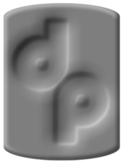 PDN File: Avatar PDN FileHope this helps a little. **EDIT: Also note to get the depression effect I use opposite shading. White against black, not black on black ... reversed it raises the letter up. So my example is a little backwards as it sounds like you want it to be raised not depressed into the surface. Or maybe I'm not able to see straight, thats the shadow you used ... argh. Round object not wanting to be round. Square peg logic.  |
|
|
|
Post by TheBad1 on Jan 10, 2012 21:46:06 GMT
1stly ... Del ... that's darned cool. Will download the file. Can't d/l the file 404 error  Never too old a dog not to learn new tricks ;D Could see this being very passable plasticine .... @ Helen ... Have you tried setting the Bevel selection (?) layer to Overlay ? This tones down the B & W a bit and help it blend in. Plus possibly the button is a bit to spherical ? The glow from the centre of it with a really dark base, sort of throws the eye a bit ? |
|
|
|
Post by delpart on Jan 10, 2012 23:19:09 GMT
Hmmmmm. That's odd. ./goes off to check things ...
Argh, file type thing in IIS ... It worked earlier ... now its reset. Mumble grumble, full control my arse ... ./changes to .zip file ...
Sorry about that. Let's try again. (And note to self, to zip them up. Save me a about 25K in storage and transfer as well so not a bad idea in the long run ... now to see what happens when I re-index everything later.)
|
|
|
|
Post by TheBad1 on Jan 10, 2012 23:39:08 GMT
It works I'll have a look when I come home tomorrow night  |
|