|
|
Post by Goonfella on May 25, 2012 5:27:53 GMT
Great new spacescape Sargon. I like the Nebula and the way it opens in the middle. It`s like a window into the far reaches of space. Nice job with the colours as well. Well worth revisiting.  The desert is great. I like the way you have managed to give it some depth with the sand dunes in the distance. I think a few rocks and stones (not too many, just enough to break up the sand a bit) and a cactus would finish it off nicely.  |
|
|
|
Post by Sargon III on May 28, 2012 6:48:29 GMT
Thank you very everyone for the nice comments, @ barbie, thanks so much. Funny there is so many unsolved mysteries before our eyes, on our own planet, but we are trying to discover and understand the far space, million of light-years away.! @ Helen, thanks so much, I am glad you liked it, I too don't like revisiting the old work, especially if I think it is complete, but I have some uncompleted projects I don't like to delete, because I know they are fixable. @ Welshblue, thanks mate, although I didn't understand the quote you've posted it, I think some slices of my brain are not working properly . @ Ella, thank you for the comment. @ AFG, it is so honor to compare me with Goonie, Goonie is way better than me, I appreciate your nice comment and the encouragement. @ venicet, thanks I am glad you like it, I still have some funny old space projects, like how you described them as a little kid's work, but always trying to improve myself, especially with help of our great friends here, do you think it's worth it to me to continue trying the space work, or should quit as it is not my style of work? @ blackpenny, thank you very much, I wish if I can see your space work, I am sure it is not like how you described it. @ Goonfella, appreciate your comment mate, means a lot to come from you, I will try the cactus, I feel it is not easy to draw with PDN especially the thorns. |
|
|
|
Post by Pixey on May 30, 2012 13:08:45 GMT
The Space scene is very mysterious and I find it mesmerizing. A bit like watching goldfish ............. rather therapeutic and dreamy at the same time. Love it |
|
|
|
Post by blackpenny on Jun 1, 2012 19:06:14 GMT
@ blackpenny, thank you very much, I wish if I can see your space work, I am sure it is not like how you described it. You're right, it's not bad - it's non-existent! I have a couple of planets from a tutorial, nothing spectacular, and I tried some other scenes, but I either deleted them or didn't save them in the first place. I'll probably give it another try someday. Although it's like gardening - I like looking at what other people do more than doing it myself. |
|
|
|
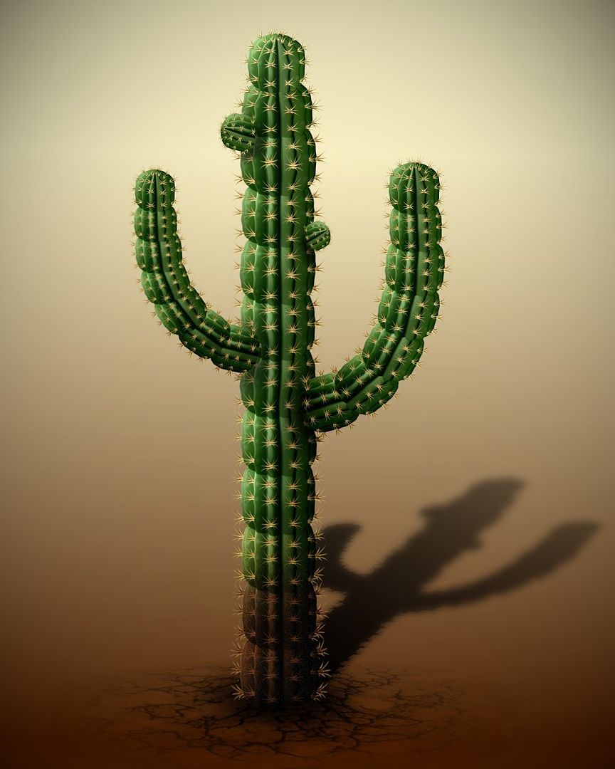
Post by Sargon III on Jun 7, 2012 9:15:37 GMT
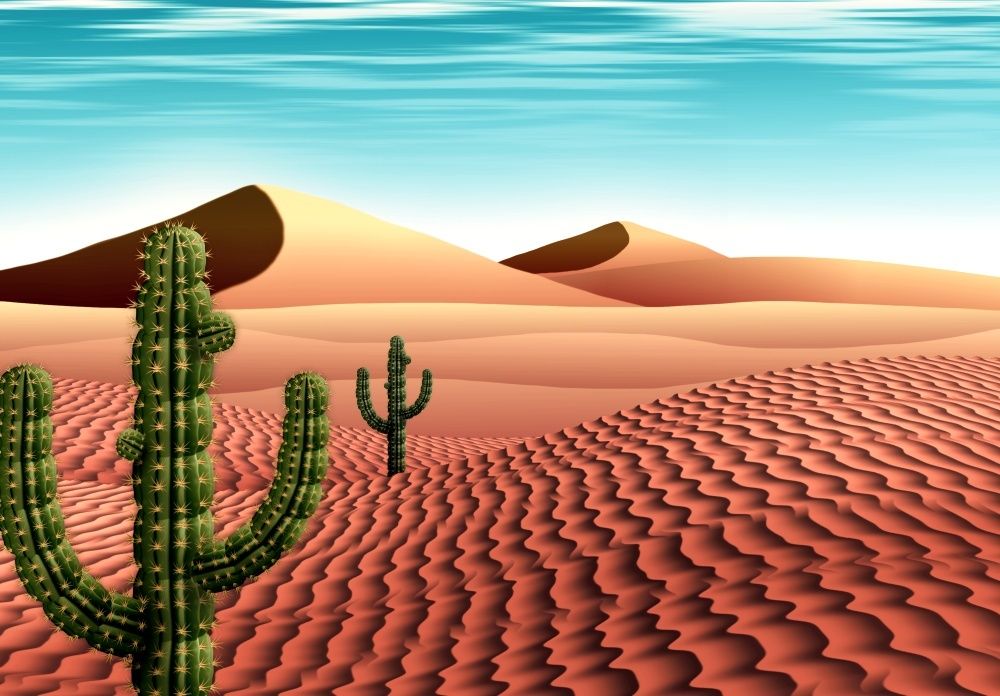
@ Pixey, thanks you very much, glad you like it. @ blackpenny, great I am waiting to see your space work one day, I know you can. As Goonie was asking to put a cactus in the sand, but really I haven't had a serious attempt on cactus before, and I decided today to give it a try, and it wasn't bad as I think: Here is the cactus that I created: 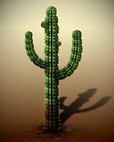 And put is in the desert, not so good I messed up the colors: 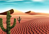 |
|
|
|
Post by Helen on Jun 7, 2012 12:32:43 GMT
Sargon, believe me, it looks really, really good.  I love the cactus's texture and the sand dunes (is that what you call them?) are amazing! |
|
|
|
Post by Leif on Jun 7, 2012 17:17:45 GMT
Autch. It looks so real i almost feel it stung me. ;D
|
|
|
|
Post by TheBad1 on Jun 7, 2012 19:24:10 GMT
Really nice job on the cactus ... I know from experience they're not easy to make.
Love the desert scene but maybe just one cactus instead of the 2 cacti (unless you want to make a different one to go with the other one)
... my thinking - nothing in nature is ever the same and it looks a tad uniform.
Not meant to take anything away from a great technique in making/ painting the whole scene
|
|
|
|
Post by barbieq25 on Jun 10, 2012 2:29:56 GMT
Sargon, I like the colours. It makes the image a bit cheeky.
The cactus is adorable & the dunes are great. They also remind me of pyramids.
The pods on the cactus makes me wonder if they are about to flower. Well done!
|
|
|
|
Post by blackpenny on Jun 10, 2012 3:38:36 GMT
I like the colours too. Sometimes whatever is in the atmosphere makes colours look unusual. Like when there's smoke from forest fires or something, the sky can look really eerie.
The cacti are more uniform than any I ever had - mine grew like mutants.
|
|
|
|
Post by Pixey on Jun 10, 2012 10:57:33 GMT
Oh yes, those cacti look like the real thing alright. I can almost feel the prickles. In fact those prickles look very, very authentic :
|
|
|
|
Post by AFG on Jun 13, 2012 7:02:17 GMT
I really like the perspective of the cacti and I love the colour of the sand, I always remember watching a program about a plane (I think it was a spitfire) that had crashed in the desert during WWII and was not found for many years as the sands had burnished it pink in colour and it became almost invisible from the air as it blended in so well.
|
|
|
|
Post by Sargon III on Sept 11, 2012 23:53:31 GMT
|
|
|
|
Post by barbieq25 on Sept 12, 2012 0:23:18 GMT
Wow! That is really well done! Needs a tute for it!!! Looks like carved stone or embossed metal that has rusted. You know in the old days when they used to weld identification on machinery & that sort of thing? Lovely work...I am so jealous |
|
|
|
Post by Helen on Sept 12, 2012 1:05:38 GMT
Sargon, this is extraordinarily amazing! The texture is unbelievable! I love how below each letter there's a small path. I'm not sure what it's called, but it's so realistic. @barbie: I think you'll be able to do something like that. In your last piece you create a similar texture. |
|
|
|
Post by Sargon III on Sept 12, 2012 18:40:50 GMT
Thanks barbie and Helen, I am so glad you liked it ;D , @ Helen, I am not sure what they call them, but I named the layers as "erosion" Actually it is not a new technique to me, I have used it before on these two images like a year ago, i562.photobucket.com/albums/ss69/sargon2/realistic/rustnor.jpgi562.photobucket.com/albums/ss69/sargon2/realistic/rustcrak.jpg but I forgot the exact steps used on them that time, that's why the new sig came out a little different, of course there is some additional effects added intentionally for SOTW purpose. And this is the clean version of it:  EDIT: @ barbie, thanks, yes I will do a tute, but I am a little busy this week, I am just trying to find an easy way to create the rusty texture, it is actually a too long technique, and it never gives the same result, I will simplify it as much as I could, especially we have now the Diffuse and Specular plugins, those will help a lot. |
|
|
|
Post by barbieq25 on Sept 12, 2012 20:44:43 GMT
No worries Sargon, same here. I used Colour Aberation for my texture & overlaid it with Clouds, Fire & erased the white of those & layer blend modes. Exactly how, I don't recall. It was fun! I still miss the Darken plugin too. The brightness/contrast adjustment is not the same  |
|
|
|
Post by Sargon III on Sept 12, 2012 21:02:35 GMT
I think the author had canceled it because "Lightness" in Hue/Saturation does the same.
|
|
|
|
Post by barbieq25 on Sept 13, 2012 6:19:27 GMT
Oh really? I didn't know that. I must try that then. Thanks so much |
|
|
|
Post by Pixey on Sept 17, 2012 11:16:24 GMT
Love your Grunge signature @yellowman. Your pieces are always wonderful - you do amazing work and give one inspiration. I'd not tired Grunge before the comp and enjoyed having a 'go' at it myself  |
|
|
|
Post by Leif on Sept 17, 2012 15:06:52 GMT
Great work on the rusty pictures. Reminds me of an old ship.
|
|
|
|
Post by blackpenny on Sept 19, 2012 16:54:31 GMT
Great work on the sig. I love the colour and texture.
|
|


 "]
"]

 "]
"]


 I love the cactus's texture and the sand dunes (is that what you call them?) are amazing!