|
|
Post by Dug on Aug 10, 2011 13:58:32 GMT
Nice work with the psychocolour plug-in.I have also been having fun with Red ochre's tweak transparency plug-in.Only used it with text so far but I am sure there is a lot more to it.
|
|
|
|
Post by blackpenny on Aug 10, 2011 16:33:56 GMT
Thanks Helen, Lance, barbieq, Pixey, Dug! I did think about posting in Red Ochre's thread. And now that the link is so handy I really don't have an excuse not to. I've played with Red Ochre's Highlight and have the Tweak Transparency plugin but haven't done much with it. Psychocolours is fun just moving the slider back and forth and watching what happens. Doesn't take much to occupy my mind.  |
|
|
|
Post by venicet on Aug 10, 2011 16:40:30 GMT
. Psychocolours is fun just moving the slider back and forth and watching what happens. Doesn't take much to occupy my mind. LOL I'm at this stage of the playing myself. I'm surprised I'm getting anything done! I love you color combinations! |
|
|
|
Post by blackpenny on Aug 10, 2011 17:00:15 GMT
I do the same with this as I do with other things - mostly experiment and rarely finish anything. I have a lot of works in progress. I love playing with colours and looking for different combinations. Some of them can be pretty god-awful, but I don't show those.  I posted in the thread on the main forum. I really should give more feedback to the plugin developers, they do such a great job. |
|
|
|
Post by Leif on Aug 10, 2011 17:20:34 GMT
I do the same with this as I do with other things - mostly experiment and rarely finish anything. I have a lot of works in progress. He, he. Me too. Me too. ;D |
|
|
|
Post by AFG on Aug 10, 2011 18:20:15 GMT
Love the vibrancy of the new works and especially the use of equation again.
|
|
|
|
Post by Goonfella on Aug 11, 2011 5:44:34 GMT
Well I can`t really add much more to what has already been said. Lovely bright colours. The spinning one is my fave. I like the movement in this image as well as the colours. Well done. |
|
|
|
Post by blackpenny on Aug 11, 2011 15:17:12 GMT
Thanks Goonie!
|
|
|
|
Post by heat stroke on Aug 16, 2011 16:57:10 GMT
Psychocolours is beautiful!  |
|
|
|
Post by blackpenny on Aug 20, 2011 16:19:56 GMT
Thanks heat stroke!
|
|
|
|
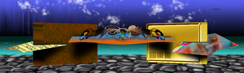
Post by blackpenny on Aug 26, 2011 16:35:28 GMT
More new work. The gold ones were started a long time ago, and I decided to revisit them and finish them off. The others are experimenting, as usual.
|
|
|
|
Post by venicet on Aug 26, 2011 18:23:24 GMT
Wow blackpenny. The gold ones are just beautiful. I'm glad you finished them. So pretty. I"m going to have to force myself to not go play with gold and try for my gem again! The other two are great as well. I'll have to find heatstrokes abstract tutorial as that one looks very interesting. Who would have thought you could make plain squares look interesting and pretty? Not me. Well done!
|
|
|
|
Post by Helen on Aug 26, 2011 20:08:23 GMT
Such beautiful abstracts! The gold ones remind me so much of Oma's works. Love the designs! Absolutely stunning! |
|
|
|
Post by barbieq25 on Aug 26, 2011 22:39:33 GMT
BP, they are so beautiful! The first abstract looks like long crystals of rose quartz. I just adore the squares one. The colours & feel are wonderful.
The heart shapes in the Sarkut Gold ones are lovely. I love the softness of the righthand side.
Well done, BP!
|
|
|
|
Post by Sargon III on Aug 27, 2011 5:55:02 GMT
Wow, I am so sorry, I didn't comment for long time on your work, some really great images in here, the Gold is awesome, and the orange pattern is so beautiful.
But the HS abstract is something else, it is fantastic, I wonder why those bees left behind their home with that pure fresh yummy honey in it, really great go on the tut, I love the Lighten blend mode effect in this, I like all your latest, well done BP.
|
|
|
|
Post by AFG on Aug 27, 2011 6:55:18 GMT
The abstracts have great depth and draw you in and the gold is excellent.
|
|
|
|
Post by TheBad1 on Aug 27, 2011 20:29:36 GMT
Some great works here.
The distorted metalwork looks great. Very Omaesque but in your style. Very bright and pretty.
Squares stands out above them all for me. I love the flow and colours in it.
The radial on the squares is a genius touch.
This would look great mounted onto a black background in a brass frame ...
|
|
|
|
Post by blackpenny on Aug 29, 2011 13:55:33 GMT
Thanks venicet, Helen, barbieq, Sargon III, AFG and Welshblue. I added the link to heat stroke's tutorial to my first post. It's fun for seeing what different plugins can do. This one started with a hexagonal grid. The squares was done in a similar way, started with a multi-colour gradient, duplicated the layer, did *something* to the top layer, and changed the blend mode, over and over until I figured I should stop. The gold ones are circle text with different effects. These ones I actually thought about, putting together the different components. It's very flattering to be compared to Oma, she is an inspiration. Seeing what she can do with Polar Inversion, I have to play with it too. Everyone here inspires me in some way, and I love how we learn from each other. Thanks again.  |
|
|
|
Post by blackpenny on Sept 4, 2011 16:14:39 GMT
I've been playing with the GridGrad plugin. |
|
|
|
Post by venicet on Sept 5, 2011 2:09:01 GMT
love the 3 new ones blackpenny. I have to get around to playing with that plug-in soon. I downloaded it, but have been working on some other things just lately. I really love the middle purple, pink one. My fav colors lately. the other two are gorgeous too. For some reason I never think to use those colors and you do the combination so beautifully. |
|
|
|
Post by barbieq25 on Sept 5, 2011 5:25:25 GMT
GridGrad 2 is my fave because I love what the colours do to my eyes. Lovely! Really lovely!
|
|
|
|
Post by blackpenny on Sept 5, 2011 18:10:54 GMT
Thanks barbieq and venicet. I really like the middle one too, I think it came from BlendModes+. And the colours in the third one are from Psychocolour. I don't usually think about what colours to use, I try different things until I get something I like.
|
|


 "]
"]