|
|
Post by venicet on Jan 12, 2012 1:05:14 GMT
ThistleDown shows up beautifully on my monitor. I love it! The colors are so vibrant and the framing is outstanding. You have such a talent and flair for this type of work. Charlie is beautiful. The colors remind me of Chinese art. The style is definitly Charleston era. Amazing work  |
|
|
|
Post by barbieq25 on Jan 24, 2012 10:25:22 GMT
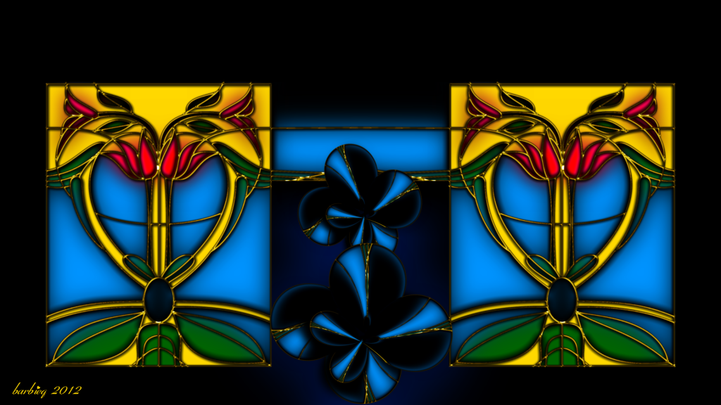
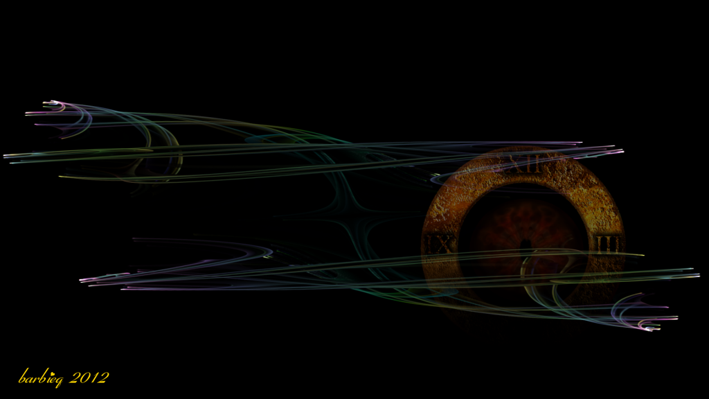
Thank you everyone for your nice comments on the Charlie image. I have made a few more art deco/atomic images but to save your sanity, I'll only post 2 images at a time. I just got on such a roll yesterday & managed to get quite a few completed.  AD Summer Love 2  Back in Time - Chaosscope & PDN Keep a look out for eyes...they feature a lot in my work of late. |
|
|
|
Post by Sargon III on Jan 24, 2012 10:44:32 GMT
Both are fantastic images, can't see the eye in ADSsummerLove2, but I see two hearts containing two alien faces with blue eyes, very pleasing image. And I like the lines in BackinTime, something like when you leave the camera shutter open and move it on lights in the night, great work barbie.
|
|
|
|
Post by barbieq25 on Jan 24, 2012 11:08:48 GMT
Thanks Sargon. Hubby liked the Chaos work in that one but he has not yet seen the finished image. Summer love does not have any eyes but I like what you see in it. Some of the others I have yet to post do. For a sneak preview, they are all on dA now ;D
|
|
|
|
Post by delpart on Jan 24, 2012 17:47:54 GMT
Striking. Summer has some wonderful inversion conversions (play intended) that made a nice focal. Almost made me thing of a perception test. Colors are simply vibrant and illicit something between painted metallics, chromed silver and glass works.
Not to mention that its, " ... just darned pretty ..." ;D
Time is what I see in my head but still am struggling to convey to my digital canvases. You literally pulled an image of sorts from my mind here that I more or less glimpsed from the previous clock-works ... If I was younger this would have freaked me out. Thankfully I just nod and smile at happy coincidences like this.
Oh and I simply love it. Love love love it. Simple refined, etc.
I'm still avoiding DA so I'll have to wait until you share them out in the wilds. ;D
**EDIT: "That figures ..." So Chaosscope is a flame/-i math visualizer ... no wonder I keyed in on that feel. And as a compliment in my rumbling, that looked like you had done some smoke effect to a polar inversion/polar whatever ... I just assumed (that evil nasty word) that you had come up with that. Now I realize that the disclaimer/description was for.
Figured I needed to share that tidbit. Now, is there a way to make that with PDN ... Since I cant create smoke or work with even crude versions on purpose to save my life maybe that's something I can add to my wishlist to actually figure out ...
|
|
|
|
Post by Helen on Jan 24, 2012 21:16:37 GMT
I left a more detailed reply on the main board, but I just want to reiterate how lovely these two images are. You have wonderful ideas. I can only imagine time travel to be just the way you made it. The lines show that time is "frozen" as the wheel makes its way through a time zone.
|
|
|
|
Post by TheBad1 on Jan 24, 2012 22:56:41 GMT
Summer Love ... First off, love the colours. Why make it complicated when primary colours do the job. Love it. The 'simple' colours with the fantastic filigree is brilliant. (Your filigree work is getting very realistic and smooth IMHumbleO) Back in Time ... do any of us really want to ? Bad enough living them once ... An emotive piece. Always a winner  I hope you post all the pieces on here. I'm not a dA person very much anymore. To be honest, being Deviously Denied after I've given so much back to the whole PDN community has left a bad taste in my mouth
|
|
|
|
Post by Goonfella on Jan 25, 2012 7:03:10 GMT
Love both these pieces Barbie. Well done. Great texture on the clock in Back in Time. There are definitely things I`d like to go back for - like when Mum was still alive. I do miss her. Summer is a lovely cheerful image. The exact opposite of Time which I find quite dark and moody (in the best possible way of course! ) As Welshy commented, sometimes keeping it simple is all you need to do. Great filigree work once again. |
|
|
|
Post by delpart on Jan 25, 2012 8:03:16 GMT
@wb: Actually yes. Just to relive the really good things. Why not. Time has gained me wisdom and appreciation of things long since passed ... Right now I'm trying to time travel to one of the better Greatful Dead Shows ( 1991 UNLV Silver Bowl, Las Vegas ) I was lucky enough to attend. Streaming audio is from the boards ... not great but its an exact copy of what I heard ... more or less. ;D The intro is more exacting with all the crowd noise. Most memorable was Santana's opening set. Much longer than I expected and simple brilliance. Too bad that isn't in this archive. Still looking for it as Jerry played with him a little toward the end as I recall. Gorgeous sunsets etc. Some chaos, but the second time around I wouldn't be that "me" anymore. I'd be this me. It would be different. Doing a game reset where I would simply replay the past like a movie? No thanks. My head does that to me all the time.  Just throwing out the positive spin on it. Most people forget there are simply some wonderful things we could visit. Experience. ... Nostalgia's a bitch, for sure, but I guess its a matter of selective experience. Then the fun Sci-Fi aspect of it. Sure, you dont have the lotto numbers handy, but I bet you can remember up and coming companies to place some bets through Wall Street on.  If I got stuck that is, that's at least one sure bet to cash in on. Righto. Just felt I had to say something positive about the idea of time travel on a micro relevant scale. I really dont like covering the all weirdness of potential time line divergence, paradox (much, its actually one of my favorites since OCD is very much like that), and the whole "what could you do to change the world" thing ... |
|
|
|
Post by barbieq25 on Jan 25, 2012 8:41:35 GMT
Back in Time refers to the second go at using Chaoscope & trying to come up with a passable image for the fractal. Also refers to me having to go back to December 2011's images to get the WIPs done ;D but I like the thoughts you all shared. Some things are worth going back for & some things were too darned hard the first time.
Thanks for the positive comments guys & girls. Sometimes we can get a bit lost in our own work. I think too that sometimes what we view in our daily lives reflects in our artworks.
So I am pleased that you think the colours for Summer Love fit.
|
|
|
|
Post by aislin on Jan 25, 2012 15:44:45 GMT
As I said before a couple times on the pdn forum I think... I do not really like abstract, but if you keep showing of your art I'm starting to really like it amazing pieces again |
|
|
|
Post by Leif on Jan 25, 2012 19:04:21 GMT
Another set of great pictures. |
|
|
|
Post by TheBad1 on Jan 27, 2012 22:39:20 GMT
On the subject of going back in time ... I wouldn't want to in case it messed up how my life is now.
If I dropped down dead 2moro I'd do it knowing I'd lived. Experimented. Good times. Bad times. Great times. Totally stupid times. Ashamed of times.
I wouldn't change any of them ... but re-visiting could take the edge off the good memories plus possibly alter who I am today. I wouldn't want to risk that because I'm infinitely nicer than I was 25 years ago
... I said that image was emotive ;D
|
|
|
|
Post by blackpenny on Jan 29, 2012 18:11:04 GMT
Great images! (I could have sworn I commented already, but it was probably just in my head. That seems to be happening a lot lately.  ) Summer Love - love the colours. Especially the dark blue. Back in Time - very nice. I like the combination of the aged look of the clock with the kind of laser-looking fractal. On actually going back in time - there are some things I'd like to revisit, such as certain teachers I'd tell off or punch in the head. But most of them are dead now. There are some good memories, but I'm a lot better off now than I was then. And a lot nicer too.  |
|
|
|
Post by TheBad1 on Feb 3, 2012 23:25:15 GMT
On actually going back in time - there are some things I'd like to revisit, such as certain teachers I'd tell off or punch in the head. There was only one I wanted to come up against again; outside of 'School'. The maths teacher who bounced a bunch of keys off my head. That hurt. Sadly he died about 7 years later of the big 'C' and I was gutted when I heard. He was a shit hot teacher who took no shit. I didn't tell my parents because I'd have gotten hit again and a law suit was something solicitors wore. I change my mind. Possibly I would go back in time. But only if I could guarantee the past 19 years- 2 months-2 weeks - 3 days with my wife. Any other changes are fair game ... a truly emotive image B' |
|
|
|
Post by Pixey on Feb 4, 2012 9:02:02 GMT
Oh my Barbieq  So many beautiful new pieces for me to feast my eyes upon ThistleDown - Beautiful, so shiny and eye-popping. AD SummerLove 2 - This is so sweet - I love it! KallySpot - the colours are just perfect - candy for my eyes. Amazing texture on the Clock ....... Wonderful work BBQ - you can have a treat now ;D |
|
|
|
Post by barbieq25 on Feb 4, 2012 12:40:58 GMT
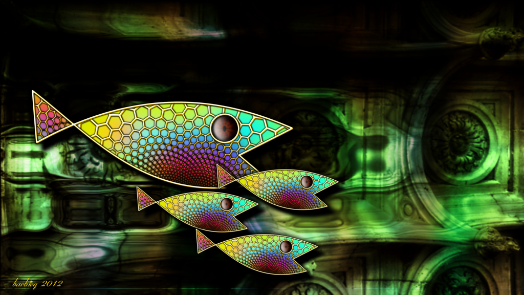
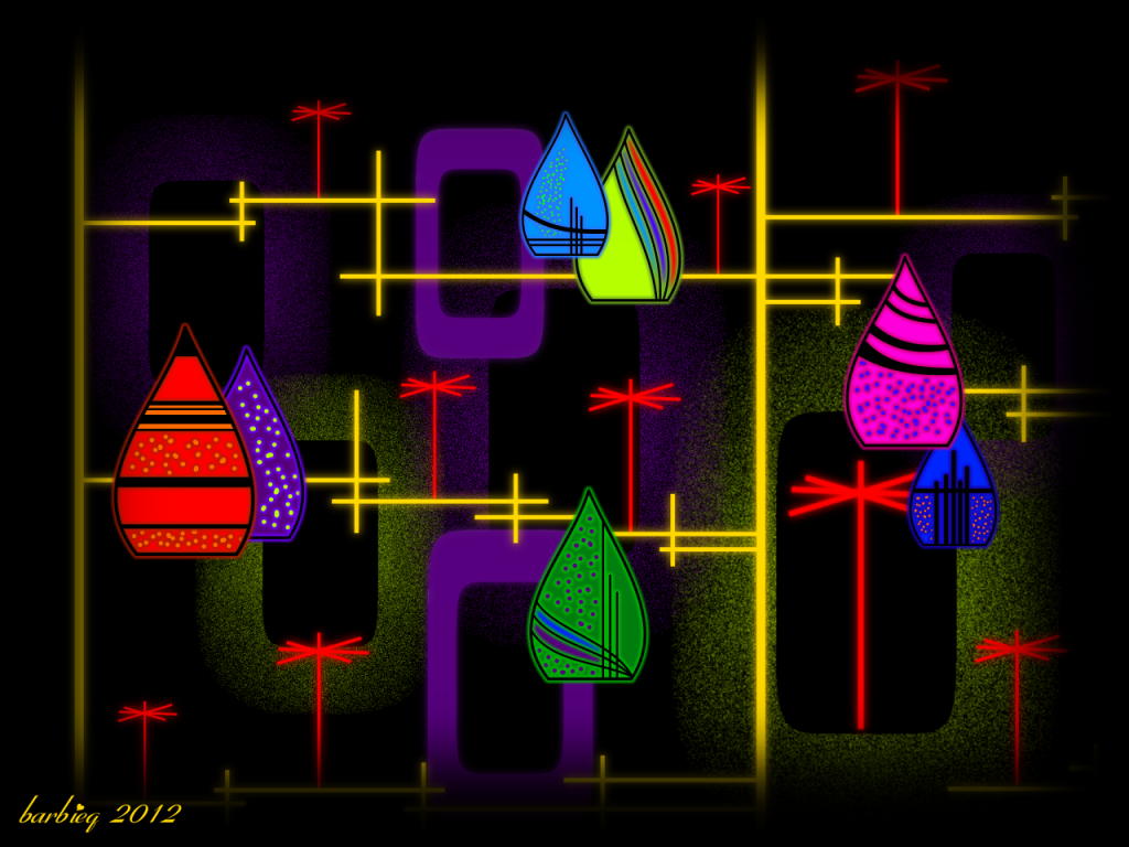
Aislin, be careful - abstract can be addictive...mind you your realistic people ones inspire me too! Thanks, Leif ;D Totally agree Welshy that there are many things I would not want to change. I have a beautiful daughter & son but I would not want those years with their father again. I also would not trade the few years I have had with my hubby. Best not to mess with time... I agree BP, I like me now better too. Pixey, thanks! I've had a couple of Merci chocolates that my Mum gave me & an ice cream Here are a couple more:  Beneath Dark Waters  Cocktail Hour |
|
|
|
Post by Goonfella on Feb 4, 2012 19:10:59 GMT
Dark Waters is awesome! I love the way you have got the watery effect in the background . The only thing I would change is the fish as they don`t `shimmer' like the water. Do that and they would look more `in' the water than outside it. Cocktail hour is a nice bright and cheerful image. Really well done. |
|
|
|
Post by Helen on Feb 4, 2012 21:58:33 GMT
Ahhhh, it looks like I entered a colorful fairty tale land. So beautiful! Both images are great!
|
|
|
|
Post by barbieq25 on Feb 4, 2012 22:33:41 GMT
True Goonie they would look good all shimmery but I forgets what I did to the water & I quite wanted the yin/yang good/evil/ dark/light, 2 sides of the coin. Like how can anyone be really happy swimming along quite nicely & then some evil bunny boiler comes along & because of the dark forces that masquerade as helpful souls, are working unseen in the background.
Represents what was going on at work.
Also proves my point that art critics often state that the artist was thinking this & that & it reflected this & that...how could anyone really know unless they knew the artist very intimately OR the artist said so.
I've just realised too that we look at artworks from different angles. Realism v's abstract. The level of realism that you achieve is outstanding! And you have a great eye for detail. I am so glad that you are here.
Helen, that is high praise from a published artist such as yourself.
The cocktail hours was inspired by the Eames/atomic era bark cloth that I saw on eBay.
|
|
|
|
Post by blackpenny on Feb 5, 2012 17:15:31 GMT
I really like the colours and pattern of the fishies, and the watery background.
Great colours in Cocktail hour too, I like the shapes and different textures.
|
|
|
|
Post by delpart on Feb 5, 2012 17:30:50 GMT
For once I didn't go rushing to look for the source on that 50/60's print ... ;D I've always been fond of that pop-art/illustration style. Same with my like the illustrated magazine colors from a bygone age. Funny that LL Bean just did a retro cover using Photoshop of real pics. Little over the top, but that's marketing.
Its well balanced. Good pattern color dispersion. Evokes the feel without being campy. Captures that odd false 3D perspective well. I'm not sure how to describe it, but that is what I call that layering style.
The fish are rather interesting. The background is dead solid watery illusion. Looks like either tiles or Madjik's perlin texture blended if you were still trying to recall part of the distortion ... I sort of like the floating vivid cartoon fish against the realism. Reminds me of some cartoon styles. Especially those with where you could see the animation plates based on the vivid nature of the colors from the overlay shots.
As always, solid composition that works, has focus in the right place etc. I'm trying to figure out why I can see this in the work, but cant lay it out in my own. Thankfully I'm able to come see examples to keep learning from. ;D
Been a rough couple of days so I took a few to tag these.
|
|


 "]
"]
 If I got stuck that is, that's at least one sure bet to cash in on.


 )
)


 So many beautiful new pieces for me to feast my eyes upon
  "]
"]