|
|
Post by Sargon III on Feb 6, 2012 0:18:10 GMT
What a lovely two images, I wanted to say beautiful fish are playing in Titanic, but then said why they are so excited, and the ruins are actually not ruins, the component doesn't look too old, so it could be Concordia and they are so happy and excited to explore a new place to play. I like the colors and the simplicity of those, and definitely seeing the eyes.
CocktailHoure, is a kind of painting that I like it to be hanged on my room wall, so simple and clear, I like the equilibrium on its elements and shapes with the cool purple makes it so neutral and relaxing after a tiring and stressed day. Great job barbie.
|
|
redeemer
Apprentice
 [D3v:undead-academy]
Posts: 28
|
Post by redeemer on Feb 7, 2012 18:22:56 GMT
Always love your art work barbie , I hope you got the note I sent you with the render ? Anyways I'll have to give Welsh's tutorial a try sometimes , although you know me , I'm no good with tutorials  |
|
|
|
Post by barbieq25 on Feb 7, 2012 21:38:56 GMT
Patty, you can do it. Seriously, if you can work out Mandelbulb, you can work a tute. If you get stuck let us know & we will help you.
I found that if you can print it & tick it off as you so the steps (or even if you write it out) it helps so much because you don't have to switch screens.
|
|
|
|
Post by Pixey on Feb 8, 2012 12:05:37 GMT
Just love the two latest additions. So colourful and pretty and I simply adore the little happy fishes  |
|
|
|
Post by TheBad1 on Feb 10, 2012 23:58:30 GMT
TheFishes ... wow. I'm not sure where to start. The fish fit the background and/or/but the background fits the fish. It's a bit like Gerald FitzPatrick and Patrick FitzGerald ... which came first ... ?
Fantastic use of PDN resources. Very clever using the hexa' grid for the scales and again a great choice of colours. I totally love this Especially the background colours
CocktailHour ... another surprise. Pleasantly so. I was thinking maybe a cocktail glass ... I wasn't expecting what I saw. Again I love it. Straight lines, curves and lots of colours ...
It's always a pleasure and a guaranteed lift in spirits viewing your new works
|
|
|
|
Post by barbieq25 on Feb 14, 2012 12:13:56 GMT
Thanks so much Pixey & Welshy. I am pleased you like them. Here are a couple more: AD Purple Satin Lonely Valentine Four Corners a collab with Patty aka Undead Academy aka Redeemer Pink Rain Scorpios |
|
|
|
Post by Helen on Feb 14, 2012 20:35:22 GMT
Barbie, for real, it's great to see you posting such lovely work. Each of them is very different, yet they're also similar. Is there a story behind "Lonely Valentine?" It's really beautiful.
|
|
|
|
Post by barbieq25 on Feb 14, 2012 21:01:14 GMT
Yep, Helen, Lonely Valentine because hubby was away...not that we celebrate it. I feel that a lot of celebrations cause distress to folk. I would have missed hubby anyway. Like Mother's Day - what about those who will through not fault of their own, never be a Mum? On the other hand, those that are quite deserve to celebrate.
Spent last night talking to my daughter whose partner was also working. We had a good long chat & I got a lovely thank you text from her in the morning. Roses come with thorns, don't they?
|
|
|
|
Post by delpart on Feb 15, 2012 4:48:33 GMT
My favorite flowers are not appreciated by most. Same with most of the desert fauna that I love to be around. The thorns made me think of both ... The desert has real thorns, the other just a quagmire of morality and legal issues.
For once I'm just having a horrible time of things. The whole Val.Day thing always gets me "off" but lately ... So I'm trying to figure out how to simply say I appreciated the deluge of intriguing work. Lonely Valentine has a lot going on and appealed the most. Not from title, but just form ... the faded reflection is something I get without my glasses sometimes ... Sort of like how I sometimes see the world captured there I guess.
I'll have to ponder the scorpio thing. I think I get it but maybe some background on how you got there with it might help ... That sounds rude in text, but just think of me as a patron in a gallery, "So what's behind this piece?" ;D
Right. I guess I found a few more words than I thought I had this evening.
|
|
|
|
Post by Pixey on Feb 15, 2012 8:42:41 GMT
For sure, as Helen said, your pieces are always a joy to see and you never disappoint with beautiful images. Yes, Lonely Valentine is my fave and I adore the colours in Purple Satin as well  |
|
|
|
Post by Sargon III on Feb 15, 2012 11:18:06 GMT
AD Purple Satin is awesome, so pure and clear, , I love also Lonely Valentine, of course all others are so beautiful, too, thanks barbie for the lovely images.
|
|
redeemer
Apprentice
[D3v:undead-academy]
Posts: 28
|
Post by redeemer on Feb 15, 2012 16:33:53 GMT
As stated on DA I love them all and you did a wonderful job with my Mandelbulb ^_^
|
|
|
|
Post by blackpenny on Feb 15, 2012 19:05:06 GMT
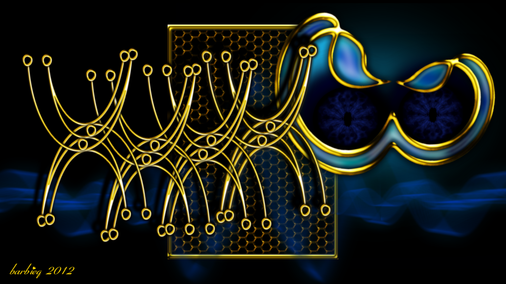
All wonderful images. I like the shapes in Scorpios and Pink Rain. I feel that a lot of celebrations cause distress to folk. I would have missed hubby anyway. Like Mother's Day - what about those who will through not fault of their own, never be a Mum? On the other hand, those that are quite deserve to celebrate. I don't do Valentine's Day either. Too much hype and commercialism. But a good excuse for chocolate, especially after when it's half price. Here's a website that says how I feel about it. anti-valentine |
|
|
|
Post by Goonfella on Feb 16, 2012 5:42:37 GMT
Beautiful images Barbie. The collab with Redeemer is nice. I love the way you have made the ribbon effect in Valentine, although maybe the highlight on the front one is a little too strong. I find it hides the brilliant work underneath a bit too much. Lovely images once again Barbie.  |
|
|
|
Post by TheBad1 on Feb 17, 2012 20:01:21 GMT
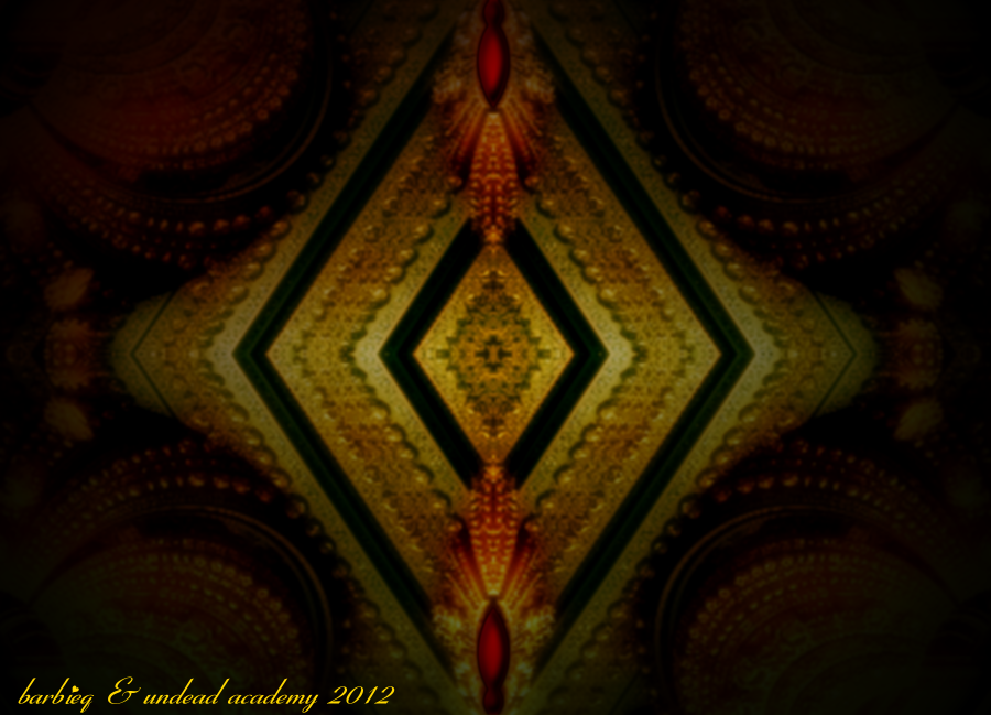
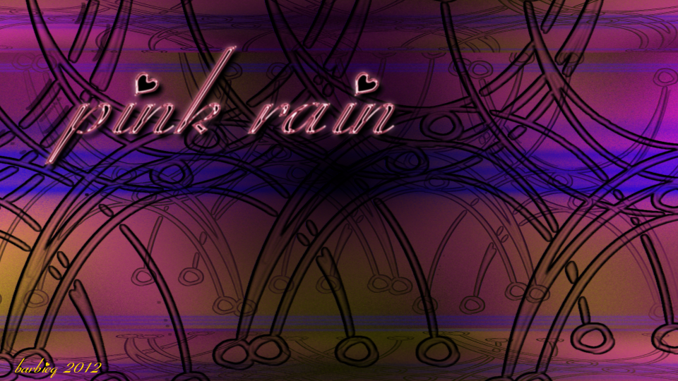
AD Purple Satin ... Proof a big background isn't always needed. Less is sometimes more etc. The star of the show is the gem and it's smoothness. Very clever how it jumps out of the screen. A winner all day long. Lonely Valentine ... This is an example when a big background really adds to an image The sense of 'out of sight but not out of mind' comes across stronger after reading your explanation of the image ... Four Corners ... A very atmospheric piece. As soon as I saw it I thought of Victorian psychics ... a great collab between you 2. (Possibly a touch of Sharpen or Sharpen+ would give the 'beads' a boost? ) Pink Rain ... Very surreal. Love the mayhem of the background behind the shiney text. (The font is a great choice.) Scorpios ... Love it. The blue and gold and the intricate shapes/ very, very clean metal work. Maybe I'm seeing it wrong but the squirly shape reminds me a lot of scorpions' tails. Also reminds me that I haven't got my son back ... t'other night I had no top on and he asked what star sign I was ... I replied, Capricorn ... he replied, ... Be careful ... You're starting to be a bit of a Saggititius. Cheeky get.
|
|
|
|
Post by barbieq25 on Feb 17, 2012 22:32:21 GMT
Delpart, the Scorpios is the "squirly shape" that reminds Welshy of the scorpions tail. Hence the name. A double scorpions tail joined. An image I made primarily for my daughter & her partner as they are both Scorpio. Thanks too, Pixey, BP, Sargon & Goonie. The highlight is a bit strong as you mentioned Goonie. Gosh I wish you were here when I do these things... ;D Often another pair of eyes helps so much. The Valentine one is a rework of the Cold, Cold Light which I did ages ago when Welshy wrote a tute for metal with the Trail plugin when Pyro first released it. That'll teach me for tidying up my files - got side tracked & created the Lonely Valentine image. Four corners is a bit blurry because I zoomed in that far on the Mandelbulb. I was going to do a jewel with it but I just really love the atmosphere of it the way it is. Something mysterious & surreal or ethereal about it. Welshy, what a cheeky little sod. Funny joke just the same...I love it - it's clever. Getting him back? 30 years should do the trick all by itself.  |
|
|
|
Post by barbieq25 on Feb 18, 2012 7:02:55 GMT
Sorry for the double post but I have some exciting news & a new work to celebrate the news with. Today we got a 1986 red Trans Am, converted to RH drive. Still has lots of work to restore it but the shell is in great condition. Going to be a great project for winter. Here is the photomanip - thank goodness hubby can take a decent photo: TransAm - Ours |
|
|
|
Post by delpart on Feb 18, 2012 19:55:32 GMT
I couldn't place where they had that on the back of the 80's models ... Thankfully people love to take pics of cars. Especially the "rear-ends" ... ;D Shame you have to put that steering wheel on the wrong side of the car. ;D (Just funny, not actually a shame at all. Plus that sort of mod is not that easy with a lot of vehicles ...) Definitely a solid source pic. The fire chicken does seem to flow up out of nowhere and lends to the reflected light on the rest as being from it as the source. Curious how much darkening was done or if that emblem still was lighting up. (Has been a long time since I've seen one in person to recall if it lights up with the rest of the taillight assembly or not ...) |
|
|
|
Post by barbieq25 on Feb 18, 2012 21:40:52 GMT
Delpart I am attaching the original sized down, so you can see what I have done. As for the screaming chicken lighting up - no idea. This is still in the resto-lostsaworkstodoyet stage. The conversion costs thousands of $$ but it has been painstakingly done to the minutest of detail. We are still tossing up whether to keep it or sell it on. We have 1 Laverda cross Yamaha to finish before September for the TX750 DownUnder rally & we have started to assemble parts for my 400/4. We are having fun collecting the parts from all over the world while our bank account is giving us that stern "we are not amused" look. I am leaning towards the cafe racer style. Not that it matters too much because I will never ride it. Big long story but a lot of it has to do with my hearing disability & balance issues. Lots of darkening was done - I think on the main forum I explained briefly to RedBeard what I did that I could actually remember. I chopped off the bright centre part of the rear & made the bird bigger. On a side note - I notice that Lomography filter sometimes gives me awful results no matter how big the image is but other times it is good even on a reasonably small image. I wonder if it has to do with ratio? Seems like it works great on 3200 x 2400 or that ratio but if I work on my screen size of 1920 x 1080 it is 'orrible. I reckon you & Sargon would most likely know the answer to that. Attachments:
|
|
redeemer
Apprentice
[D3v:undead-academy]
Posts: 28
|
Post by redeemer on Feb 18, 2012 22:34:56 GMT
Well done barbie :0
|
|
|
|
Post by Sargon III on Feb 19, 2012 4:31:03 GMT
What you have done to the car photo is awesome barbie, I really don't use this style, I mean I have never tried the lomographic effect before, I know it has some special rules, and those rules are actually "it has no rules".
I have the Lomographic plugin but have never used it, so I am not sure how it works on different aspect ratios, in my opinion the lomography style works better on 3:4 and close to it, therefor BoltBait designed it for that ratio, and I believe the colors affect also the result, if you run the Cross Processing plugin before the Lomographic you will get a good result too, and in your photo there is a strong glare and you can reduce that with the Unsharp Mask pluing.
|
|
|
|
Post by Goonfella on Feb 19, 2012 14:51:39 GMT
Great news about the Transam. Awesome car. You are certainly busy with your bikes as well. Shame you won`t be able to ride the 400/4 when it`s finished. I must get my Fireblade out a bit more. I tend to have problems with rheumatism in my hands though ( a result of 14 yrs working in the freezers at work) so unless it is reasonably good weather I don`t go out on it. After 15mins my hands start hurting in the cold. Every winter I think about selling it but then the weather starts to warm up, I take it out for a spin and wonder what I would do without two wheels. |
|


 "]
"]


 "]
"]