|
|
Post by heat stroke on Feb 5, 2011 18:03:38 GMT
Thank you so much Helen! Thanks AFG! I did not think about that... Lets say the orb is made out of ultra reflective materials!  I wont be able to change this picture, but I will apply your tip in the next orb project! Thanks again! Thank you Pixey! That means a lot! Thank you BP! I thought it would be cool to make the panels with my own abstract. And to make the reflections go on and on and on.... Thanks again everyone! |
|
|
|
Post by barbieq25 on Feb 6, 2011 8:32:52 GMT
See that is the thing Heatstroke, we can remember these things for the next time & by reading this everyone else can too. This is what I love about being here.
|
|
|
|
Post by lancemcknight on Feb 6, 2011 14:18:30 GMT
Very nice adaption of Barbie's tutorial. I like how the image simulate motion, like one of those high speed capture of a water gushing through a pipe, and this is what I see in this piece. Very nice!
|
|
|
|
Post by heat stroke on Feb 7, 2011 16:04:40 GMT
Exactly Barbieq, could not have said it better myself! Thank you lance! I was hoping for that! |
|
|
|
Post by heat stroke on Feb 10, 2011 3:09:41 GMT
Sorry for the DP. I was experimenting again with a different technique and it turned out decent enough to post. I have been experimenting (in my little free time) with techniques that I have never used before. They might not look great, but I am gaining knowledge. Anyway, here it is:  Interesting, I just realized that I have been doing a lot of blue lately... I'll try to switch that up a bit more. |
|
|
|
Post by barbieq25 on Feb 10, 2011 6:12:27 GMT
Nothing wrong with blue old son I find I tend to go through stages of colour too. Not sure why that happens but I see it in other artists too. Result is great! I love the amount of texture & shapes & of course, the colour! The bubbly texture is like lava & the scratchy swirls work really well. |
|
|
|
Post by AFG on Feb 10, 2011 12:02:43 GMT
Really like the combination of effects, it's all working in harmony  one piece of advice i would give though, is post the work you feel are not so good... we all learn more from those works simply because we are less protective of them and are more open to advice on how to improve them |
|
|
|
Post by Leif on Feb 10, 2011 18:36:05 GMT
Would make a nice wallpaper. |
|
|
|
Post by chrisco97 on Feb 10, 2011 20:53:53 GMT
That would make a nice wallpaper! Nice work on it.  |
|
|
|
Post by barbieq25 on Feb 10, 2011 21:24:52 GMT
AFG is right. I have learnt a lot from people posting WIPs & images that still needed a bit of work. Never be afraid to post one because we are here to help each other.
|
|
|
|
Post by TheBad1 on Feb 10, 2011 22:45:37 GMT
Nope, nothing wrong with blue. Although, considering it's my favourite colour; bizzarely I seem to use red more  Love everything about this mate - great textures, I especially like that part that looks like smoke clouds. Very, very good |
|
|
|
Post by Pixey on Feb 11, 2011 8:33:45 GMT
I really like the blue cataclismic piece. Fabulous color and shiny too |
|
|
|
Post by oma on Feb 11, 2011 15:05:01 GMT
love the latest one waterworks. It so reminds me of going to the casino here. They have this tunnel that goes right thru the middle of an aquarium, water up over , under and each side and all glass. Its like walking right in the middle of the ocean of tropical fish without having to do the scuba equipment. I can see this being turned into something like that very easily. ciao OMA ps great use of barb's tut.!!!!!!!!!!!!!!!!!!!!! |
|
|
|
Post by heat stroke on Feb 18, 2011 13:52:05 GMT
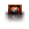
Sorry for the huge delay, I was not ignoring everybody. I got slammed with college work last week and this week (midterms). Unfortunately that comes before PDN. Thanks Barbieq! I have found that I really like blue in abstracts. Dont know why.. My favorite color is red. Thank you AFG and Barbieq! That makes sense. I dont know why I never did that before. Below are the "others." Thanks Leif and Chrisco! I am trying to remember to make them larger from now on. That "black star" piece is still ripping me up. Thank you Welshblue! Weird... I use blue a lot and red is my favorite color... Thank you Pixey! I love shiny! Thanks Oma! That would be amazing to see! Im going to start experimenting with Waterworks, maybe I can get that effect... Barbieq's tutorial ranks as one of my favorite tutorials! Others:    Darth Ford: 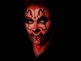 Achieved 3rd in the photomanip contest on the main forum. stockBanners: 1st:  2nd (with a one pixel bevel):  Which is better? Does the bevel need to be more? |
|
|
|
Post by chrisco97 on Feb 18, 2011 15:16:06 GMT
I think you should define the bevel more, but I love the second one.
I love all of the new images! "Darth Ford" is pretty cool. Is it a picture of Harrison Ford originally?
|
|
|
|
Post by heat stroke on Feb 18, 2011 19:07:19 GMT
Thanks Chrisco. Do you mean like this?:  I increased the bevel effect a bit. Yes, Darth Ford was originally Harrison Ford. But he turned to the dark side. The stock is under the image. |
|
|
|
Post by Helen on Feb 19, 2011 0:21:13 GMT
|
|
|
|
Post by barbieq25 on Feb 19, 2011 0:43:07 GMT
Upping the bevel has worked a treat. I like your new ones & congrats on the photomanip place too. I genrally like blue better than red but for some reason I do a lot of red images I like the new abstracts. The fractured look is one that I really like a lot. |
|
|
|
Post by heat stroke on Feb 19, 2011 15:09:49 GMT
Thanks Helen! I just do random effects most of the time. I can honestly say that there really is no set method. Just randomness with the goal to make something. I tried to make it look like Ford, but the tats covered up most of the contours of his face, and when you put sith eyes on anyone, it is hard to tell who they really are. But Im glad you like it! Thank you Barbieq for the tip. I like it as well. Thanks for all your kind words. now that I have some free time, I can start working on some WIPs. My list of WIPs has grown too large... |
|
|
|
Post by blackpenny on Feb 19, 2011 17:27:02 GMT
Great abstracts! I work pretty much the same way, keep trying things until I get something I like.
I like the banner, too, and Congratulations on the photomanip!
|
|
|
|
Post by heat stroke on Feb 19, 2011 18:44:47 GMT
Thanks Blackpenny! Much appreciated! This is a new WIP that I started about 2 weeks ago. I need opinions on the top left corner... The original of this piece is 4500X4500 and the resolution is 300ppi. Its a monster and I have over 10 PDN crash logs on my desktop. And I forgot to mention that it has taken me 5 PDN files completely filled up to complete it this far. This is for the Celldweller fan art submission. If it is accepted, then it will be included in the official CD booklet. But I dont know if it is ready to be submitted...  And it is 95% PDN. I only used a stock for the bright stars in the lower right corner. |
|
|
|
Post by Leif on Feb 19, 2011 19:01:21 GMT
Well, i am pretty  Such bright colors and enormous amount of details. Top left corner? It is a matter of WHAT it is meant to look like. (If anything in particular ) IF it is meant to look like a sun i am missing a bit more outline. Not to much though. Just a little bit. I am thinking about it looking like the space around a star about to go supernova. (Loots of gas and material being blown out into space. ) 4500X4500; i am used to that. ;D 300ppi? Interesting! *My mind starts to wonder* ; *CPU in PC starts getting scared.* ;D |
|

 I wont be able to change this picture, but I will apply your tip in the next orb project! Thanks again!


 "]
"]


