|
|
Post by blackpenny on Oct 10, 2012 17:12:13 GMT
Barbie, your crocheted rat is just adorable! As cute as the real one.
Sorry to hear about Maggie. I'm still feeling sad about the dog, it's so quiet without her and kind of boring too.
|
|
|
|
Post by barbieq25 on Oct 11, 2012 11:49:08 GMT
Yes BP, we feel the loss. I felt bad for you when you little furry friend was getting so fragile. Always hard when you have them for a long time.
I am planning on making more of them & getting into amigurumi more. I'll post images when I get more done.
I love crochet & knitting as much as I love art & the two kind of overlap for me.
|
|
|
|
Post by barbieq25 on Jan 8, 2013 10:04:10 GMT
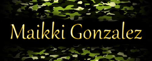
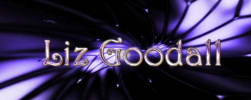
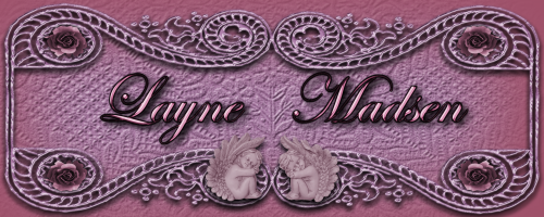
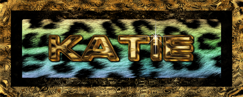
Gosh it have been months since I update this. How very slack of me. I've been making some sigs for ladies on my FB crochet page. The tell me briefly colour/style/name & off I go making something they love. I really enjoy this as some of the colours like the teal & brown combo just leaves me staring into space. Seriously? You want those colours? Together? That was the Babalicious one which I really like! 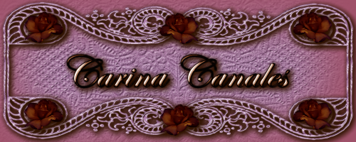 Background wallpaper, roses are stock & the vintage frame was a clipart. Didn't make that too clear on the main forum...oops. 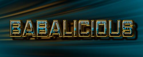 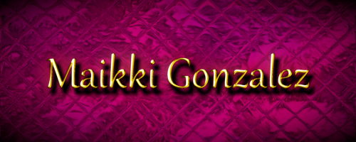   |
|
|
|
Post by chrisco97 on Jan 8, 2013 10:37:02 GMT
Very creative! Love them!  |
|
|
|
Post by Leif on Jan 8, 2013 17:30:19 GMT
Great. I missed you work here.
Somehow "Babalicious" is my favorite. But they are all great.
|
|
|
|
Post by Goonfella on Jan 8, 2013 18:53:12 GMT
Just commented on the main forum but even though I now know that the first one is clipart and stock roses I still like that one the best. You still had to put all the different pieces together properly after all and you did a great job.  |
|
|
|
Post by Helen on Jan 8, 2013 22:44:39 GMT
Wow, barbie! All names are done so perfectly!  The first one's very decorative. The second one, "Babalicious" is beautiful. The name reminded me of the "Bublicious" gum I love. All stunning works. Oh, and it's great to see your work showcased here. I missed them. |
|
|
|
Post by Pixey on Jan 9, 2013 17:31:58 GMT
I second what Helen says ...... but I especially love the first one most. I guess because of the lace. The colours in Babilicious are so beautiful and are just perfect with the text. Lovely sigs  |
|
|
|
Post by blackpenny on Jan 10, 2013 19:30:05 GMT
What a great variety of styles and colours. I love them all, can't pick a favourite.
|
|
|
|
Post by barbieq25 on Jan 12, 2013 13:48:12 GMT
Thanks everyone for your encouraging feedback. I am making these for ladies on the "Pay it Forward: Facebook website. It started out as a crochet website but we are now exchanging gifts all over the world, supporting each other through tough times & happy times. Here is the lastest batch I have completed. 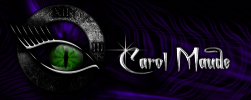  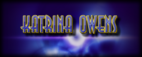 For Carol Maude's I reused an old image since the brief was black, purple, silver & green like her eyes with a witchy/mystical feel. I hope she likes it. There are quite a number of Red ochre plugins - Katrina's using Clipwarp, Trouserflare & Carol used the Highlight one. Thanks Red!! |
|
|
|
Post by barbieq25 on Jan 13, 2013 1:24:43 GMT
|
|
|
|
Post by Helen on Jan 13, 2013 3:05:11 GMT
|
|
|
|
Post by barbieq25 on Jan 15, 2013 12:01:47 GMT
Tennis is on TV Helen! Actually it started with me showing one of my students the power of PDN. I posted her sig I made, others asked & so I made them. Now I have had a request for a paid commission Chuffed I am! This image was a request for a Facebook cover page. I am hoping it may lead to other work.  |
|
|
|
Post by Pixey on Jan 15, 2013 14:41:26 GMT
O M Goodness That is so absolutely amazingly beautiful. A real winner BBQ |
|
|
|
Post by Helen on Jan 15, 2013 15:28:53 GMT
Once you start getting commissioned, you don't want to stop. You feel that people appreciate your work. By the way, the FB page banner is stupendous. I love those glass cherubs on the sides of the banner. The letters are impressive! |
|
|
|
Post by Leif on Jan 15, 2013 17:10:50 GMT
Impressive. Great use of effects and colors. The color scheme is a bit minimalistic, but a great combination.
|
|
|
|
Post by blackpenny on Jan 18, 2013 18:03:07 GMT
Gorgeous! Congratulations on the commission. |
|
|
|
Post by Goonfella on Jan 19, 2013 6:06:36 GMT
Outstanding Barnie ( sorry - Barbie. Little slip of the typing finger there! ;D ) And congratulations on getting the commission. |
|
|
|
Post by chrisco97 on Jan 20, 2013 9:28:42 GMT
Wow Barbie, they are all so stunning! I love them all! It is amazing how each one of them are so different, but they all have a similar feel. Awesome job! |
|
|
|
Post by barbieq25 on Jan 22, 2013 12:08:41 GMT
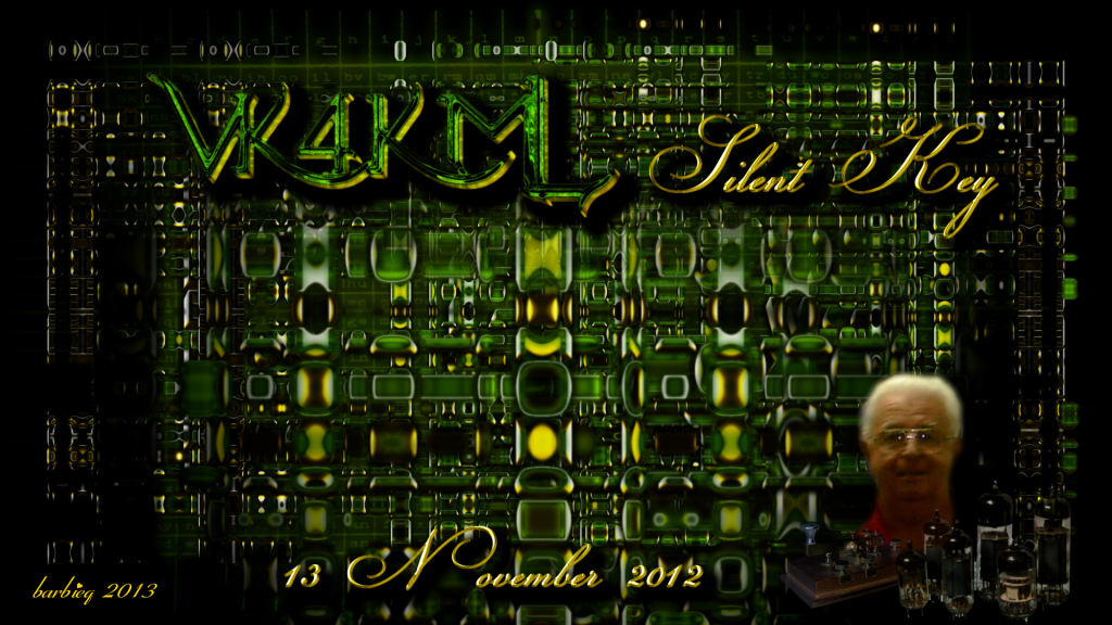
Thank you everyone for your kind comments. Yes, the FB cover is a bit minimalistic Leif & a real challenge for me not to fiddle & put too much in. It is also not dark! Woohoo! Hopefully Helen it is the start of something good. I know you understand what it feels like to have people pay for your art. Rightly so too because it is really lovely. It has an innocence that is so refreshing. I did another piece in exchange for something hand made coming from America. She wanted to see what it looked like without the dome highlight. I don't know which one is better. I think the highlight one? 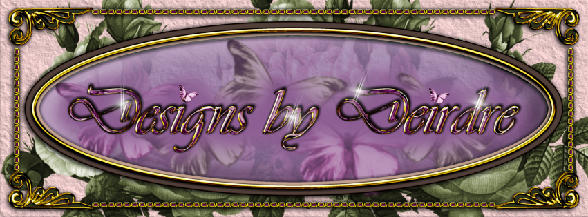 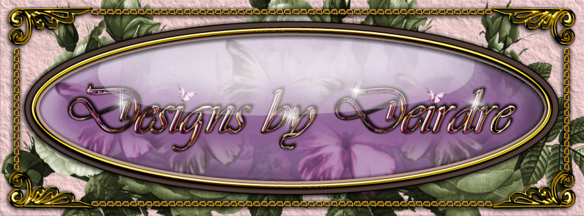 The butterflies & the roses are stock but the paper is from here: forums.getpaint.net/index.php?/topic/21946-rough-paperpapyrus/page__pid__355024__st__0&#entry355024 (a very easy to follow & simple tute). Last year I lost another friend to cancer. He wasn't a young man but he was a great friend & he did a lot for the Amateur Radio Club as President for a few years. He also helped me through my own battle. This is how I always want to remember him. The photo is one I had of him when he was in my computer class for oldies. Best class ever. 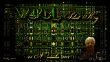 |
|
|
|
Post by Helen on Jan 23, 2013 0:29:09 GMT
Barbie, both banners "Designs by Deidre" are gorgeous. I agree that the highlight one is better since it has a nice gloss to it. Maybe make it more transparent, though.
Great job on your friend's image. It kind of looks like the inside of a computer or radio. Lovely colors and idea! I'm sorry about your loss.
|
|
|
|
Post by chrisco97 on Jan 25, 2013 10:02:12 GMT
I hope you end up going somewhere with this, they are all so stunning. Between the two, I prefer the one without the highlight. I feel the highlight kind of takes away from the text in a way. Both are fantastic though. I love the radio image. It does remind me of the inside of a computer. So very nicely done. Sorry about your loss though. |
|


 "]
"]
 The first one's very decorative. The second one, "Babalicious" is beautiful. The name reminded me of the "Bublicious" gum I love.


 "]
"]